• Home
  • About
  • Transformation Stories
  • Contact Us
  • Blog
    • Blog
    • Perspectives
  • Home
  • About
  • Transformation Stories
  • Contact Us
  • Blog
    • Blog
    • Perspectives
10 Packaging Structures that caught our eye
  • August 14 2018|
  • 0 comments |
  • Category : Blog

Packaging is a core part of building and creating a brand image with the end users. The packaging of the product is the first point of contact the brand has with the customer. An impressive packaging helps in creating a brand impression in the end user’s mind which elevates brand recall during a subsequent purchase.

While keeping in mind attractive packaging strategy, a brand needs to tread carefully. You wouldn’t want to overdo it. A simple, but memorable packaging can prove attractive and a too-clever-by-half experiment can be damaging to the brand’s image. Remember, the key is to stay aligned with the core values and Purpose of the brand -the packaging should visually represent the same ideals that it reveals in everything else that it says or does.

A good packaging does two things:

  • States what the product is without much ado
  • States the brand’s core values

A good packaging is an amalgamation of these two. Having said that, let’s look at some examples of innovative, memorable packaging designs that do all that and more!

Here is a list of 10 creative packaging structures that caught our eye:

Spine Vodka


spine-vodka-concept-johannes-schulz-5


Source: https://www.designisthis.com/blog/post/votka-spine-johannes-schulz

Spine Vodka is high quality vodka with a refreshing and creative bottle design. The bottle is designed by German designer Johannes Schulz. The packaging subtly communicates the message that it’s a brand with a ‘backbone’.

Delicious Milk Soap

static1.squarespace

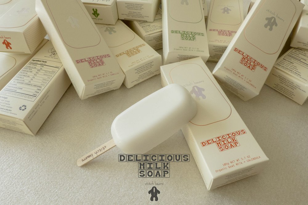
Source: http://www.thedieline.com/blog/2014/10/1/stitch-bears-delicious-milk-soap-pops

The Delicious Milk Soap caters especially to infants and babies. Made out of pure goat milk, the company took to this creative design to communicate the message of purity. Designed as an ice-cream bar, it implies that it’s so pure that you can eat it!

Thelma’s Cookies

satmfg_thelmas_box_1

Source: https://www.packworld.com/article/food/bakery/cookies/oven-box-design-delights-thelmas-treats

Freshly baked oven cookies delivered in an oven box! How innovative is this idea. The packaging simply communicates what the brand is doing.
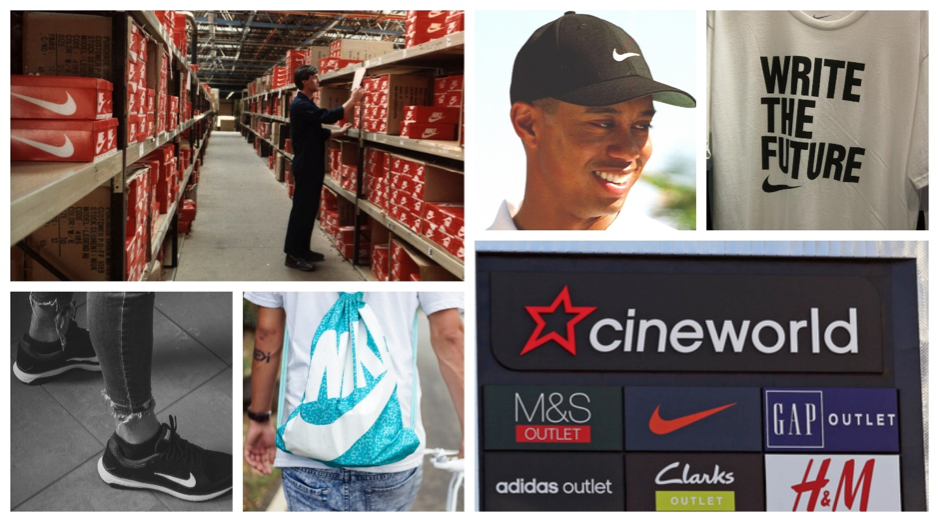
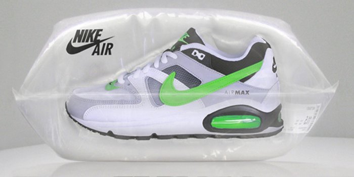
Nike Air

06_15_2013_nikeairconcept_1

Source: http://www.thedieline.com/blog/2013/6/17/nike-air-packaging-concept.html

Nike is known for its top quality shoes and innovation. It took the innovation a notch higher when they launched their Air collection. They ditched the regular cardboard shoebox and packaged the shoes in a bag of air!
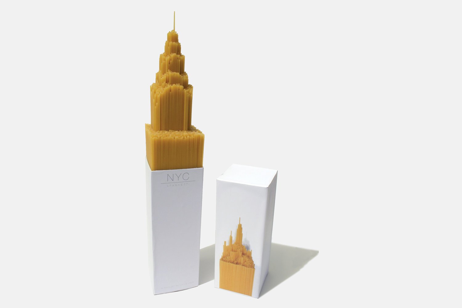
NYC Spaghetti

static1.squarespace

Source: https://www.alexcreamer.co/nyc-spaghetti/

This is the most innovative product packaging we came across. The award winning design was designed by Alex Creamer who designed the bottom of the box in the shape of the Empire State Building which forced the spaghetti to emerge from the box in shape of the Empire State Building -an NYC icon like no other.
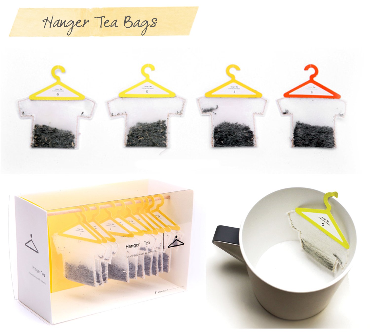
Hanger Tea


hanger_tea copy

Source: https://www.pinterest.com/pin/608408230879589009/

How annoying it is when the tea bag slips into the tea cup and you have to fiddle with a spoon to take it out? Well, Hanger Tea has a perfect solution for you. The packaging is not only cute and innovative but is designed to address this problem. The tea bag hangs comfortably at the edge of your tea cup making it a hassle free experience. The packaging references a dryer line at a laundry to make the association amply clear.
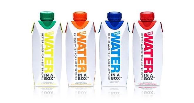
Water in the Box

vivid-water-in-a-box-fb

Source: https://www.foodbev.com/news/water-in-a-box-from-vivid-waters/

This packaged water company addressed a lot many issues with this innovative packaging. Firstly, it broke the stereotypical ‘water bottle’ image. Who says that bottle has to be made out of plastic? And, by breaking that stereotype, the company adopted a ‘no plastic’ eco-friendly approach. It’s refreshing -and it’s in a box, even while being out of the box!

Zen Bamboo Perfume

IgorMitin_ZEN_01_1000

Source: https://igormitin.com/ZEN

This is a brand that believes in letting your packaging communicate what your product is. Zen Perfume took this to the next level by designing a Bamboo perfume bottle that looks like a stem of living bamboo!

Green Berry Tea

8c0b0f27944237.560153ef5e335


Source: https://www.behance.net/gallery/430557/Origami-Tea

Who says a tea bag has to be a boring square? Green Berry Tea experimented with the design of their tea bag and came up with this beautiful design that allowed the tea to take wing.

3M Solar Earplugs

a0d34221262041.562fe3a01080d


Source: https://www.behance.net/gallery/21262041/3M-Volume-Down-Packaging

The product is an earplug for those forced to work around loud noises -their need is to “turn it down”. The subtle design made this need clear with an innovative volume knob. To open the bottle, you need to turn down the volume. Now that’s what creating an impression with minimalistic design means.

Impressive packaging is as much about design as it is about what makes the product what it is. These great examples show that when the two factors come together the result is spectacular.

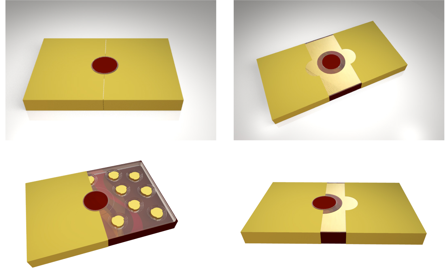
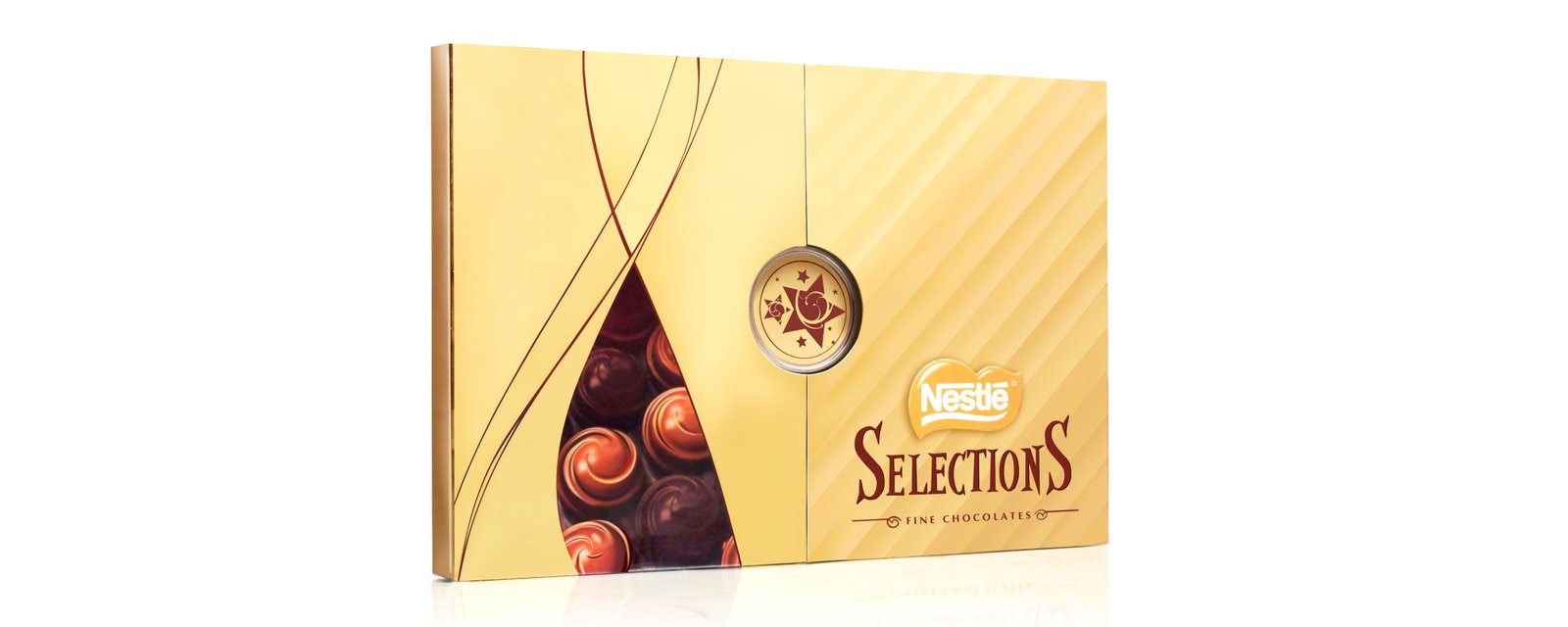
And at Lokusdesign, this has been our own experience too. Some time back, we were commissioned by Nestlé to design a premium gift box for their Selections chocolates.

What does the experience of gift giving and receiving constitute of and feel like to Indians? And what role does packaging play in this? This was the start point of our partnership with Nestle towards designing a premium gifting experience for their Selections chocolate box.

Our insights helped us break the monotony of chocolate gifting in India by way of a concept, which was centred around a ritual that built curiosity and anticipation into the whole gift giving- receiving- unboxing experience. The design struck a perfect balance between Nestle’s international brand image and India’s cultural sensibilities.

Our engineers perfected the gift box to the finest aspects, eliminating rattling of chocolates from the inside and distortion of the box from the outside while our designers developed stunning graphics to deliver a truly premium experience.


Untitled


nestleKeen to design clutter-breaking packaging for your products as well? Write back to us on info@lokusdesign.com.


Remembering Some F & B Branding Fails
  • July 27 2018|
  • 0 comments |
  • Category : Blog

Branding is nothing short of effective storytelling. Ideally, a brand must introspect on what its core values are, and craft a relatable story that will help audiences connect with their values. And although brands may have the best intentions, if they are not a hundred percent clear of their own messaging, they could fail in communicating their essence, which could, in turn, hurt business. Another factor that marketers need to be sensitive towards is the ecosystem around them. Many brands have tried to use wit and humour but have ended up hurting the sentiments of others and humiliating themselves in the process. This is especially true if the attempt at “cuteness” is not in keeping with what people believe is at the heart of the brand. Keeping this in mind, here are a few branding fails which we all could learn a thing or two from.

Bisleri Pop hops on the cola bandwagon

4f16d474ce1963df7624f3a02b18504b_385_650

Do you remember Bisleri’s line of soda which was available in Indian markets for a very brief period of time? Chances are, you probably won’t. The mineral water company got ambitious and decided to hop on an already overcrowded wagon- the cola stage. Now there’s very little you can do to differentiate yourself in a space which is already in the red zone for most audiences, with people trying to make healthier choices. There was absolutely nothing original or unique about these sodas, they were as sugary and carbonated as their competition, and they even looked like knock-offs of popular brands. Of course, a consumer is more likely to reach out for a can of Coca-Cola over a can of Spyci since the later just looked like a rip-off of the former. Consumers who looked to Bisleri for the transparent purity of their water were probably confused about what to think about the brand.

Lesson learned: Do what you do best, stay true to your brand and don’t be a sheep.


Danone tries to take on dairy in India

Screen Shot 2018-07-27 at 2.50.42 PM

The French dairy company, Danone, has finally decided to call it quits after three failed attempts at entering the Indian markets. Although on paper it may seem like Danone did everything right, from ‘Indianising’ their products, case in point Danone Mishti Doi, to running extensive campaigns in India, they didn’t take into consideration the industry itself. India has had a long-lasting relationship with dairy, and Danone was no match for our homegrown dairy brands like Amul and Gowardhan which have now become household names. They did this by flaunting their Indianness at every available opportunity and the consumers (figuratively) lapped it up given the strong cultural tie-in our nation’s various regions and religions have with milk. There was simply no space for yet another dairy company to make a mark in the Indian market, unless there was something absolutely strikingly different, somehow from the competition- which there wasn’t.

Lesson learned: Understand the strength of the incumbents before you try to venture into unknown waters.


Pepsi’s Live for Now campaign

130_Screen_Shot_2017-04-05_at_10.45.59_AM-panorama

In this ad which left the whole world appalled, a privileged Kendall Jenner is shown leaving her comfy modeling job to join an unspecified protest with a bunch of disgruntled youth. As the ad progresses, conflict arises between the protesters and the police, enter Kendall Jenner with a bottle of Pepsi. The model then hands a cop a can of Pepsi, and voila! All the protesters are elated and the issues have magically been solved. The only plausible explanation for this rather ill-timed ad was to appeal to the youth “woke” culture. In doing so, Pepsi managed to trivialize and marginalize whatever was being protested against, drawing attention away from social causes to corporate gain by saying fractures in society can be fixed by opening a bottle of Pepsi, obviously, the real world is much more complex than that. In essence, Pepsi represents a sense of fun and enjoyment -values that couldn’t contrast more with the seriousness of the occasions they were trying to newsjack.

Lesson learned: Stick to what your brand represents instead of trying to opportunistically relate to every audience. 


Wendy’s digital stand-off with a customer

kelsey-d-atherton-athertonkd-what-stage-of-capitalism-is-it-34416212

Above is a classic example of brands trying too hard. Here, KFC is seen poking fun at a competitor by using a political analogy, but Wendys took it a tad too far. This is an ever-present danger in today’s complex and polarized times. In an attempt to be witty and sassy instead of just sticking to the brand’s principles and practices, Wendy’s received a public backlash. The original “mine is bigger than yours” note to McDonald’s may have been on the edge of reasonable comments but the gravy really hit the fan for Wendy’s when they replied to one of its customers with a Pepe the frog meme. Pepe was co-opted by white supremacists during the 2016 presidential elections, and hurt the sentiments of many, for obvious reasons.

Lesson learned: Do not try to outwit your customers, it will only go downhill from there. Instead, voice what your brand stands for and stick to those guns. 


McDonald’s takes a stand

trump

After the US presidential elections, MacDonald’s decided to follow many other brands who decided it was a good idea to dis the new president. Caught up in a storm of competitive tweeting and confused about what they represented to their millions of fans, they shared a tweet in an attempt to burn President Trump, but things didn’t quite go as they expected. With a large portion of the nation and MacDonalds’ core audience aboard the Trump train, MacDonald’s got left behind and experienced a significant drop in sales. In a desperate attempt to win back customers, they issued an apology claiming they were hacked. This not only made the brand appear spineless but also deceitful since Twitter as a whole was highly skeptical of Mc Donald’s being hacked. It’s also important to note that they clearly hadn’t understood their own demographics and target audience, the health-conscious, sustainable brands that took a liberal stand were seen as more genuine and they received a lot of support from their core constituencies. Mc Donald’s, on the other hand, caters to an entirely different segment, clearly an important consideration if you must take a political stand.

Lesson learned: Stay away from politics unless that is what is true to your brand. 


Cinnabon monetizes the passing away of Carrie Fisher

161228121948-cinnabon-carrie-fisher-540x304

It’s one thing to use a Cinnabon in a 4th of July creative, maybe as a part of the fireworks, but it’s another thing entirely to use one to replace the iconic bun of Princess Leia, played by the late Carrie Fisher. That’s insensitive and uncalled for. Clearly, no brand must stoop so low as to try and cash in on the death of another human being. Those sweet, sticky, curvaceous buns have little to do with the passing of someone -indeed which product does?

Lesson learned: It’s a sad day if it has to be said that the death of a human being MUST not be leveraged as a product placement opportunity. 


What these ill-considered but possibly well-meant fails tell us is that brands should not try too hard. The Pepsi campaign was a textbook example of a brand trying desperately to connect with a broader audience but failing. Cinnabon was a classic example of brands trying to force-fit their products into current affairs, without context or regard for the sentiments of others. Brands should stand true to who they are, this will ensure that their communication is always genuine. This will help the brand stand out in a space where competitors are struggling to genuinely connect with an audience without losing their inner brand voice.


Want to avoid a failure for your brand? Write to us on info@lokusdesign.com.


Best practices for restaurant / hotel branding
  • July 26 2018|
  • 0 comments |
  • Category : Blog

When you walk into an establishment, be it a restaurant or a hotel, what are the first things you notice? As marketers, the first things we may notice are logos and fonts, but what about the patrons? They will enter your establishment with minimal expectations, so what they may see will make a lasting impression. Often, the first things that we typically notice are décor, colours, furniture arrangement, and the general ambience of the space. It is this “feel” that will determine your first impression, and in the hospitality business, first impressions are everything. This is why there is no scope for being casual.  There is a fine line between classy and in-your-face, and within these fine line lie a few practices that will help you convey your principles and identity through your branding.

Practice 1: Create a brand playbook

One of our clients, Effingut, had an uphill challenge to face- standing out from the crowd in a space that’s already cluttered with cut-throat competition. The marketing collaterals we designed for them are in complete harmony. This is the outcome of maintaining a brand playbook- synchronicity and harmony in your communication as a brand. No matter how big or small your establishment may be, a brand playbook is a must. This is a detailed book which has a detailed set of colour schemes, fonts, imagery, and aesthetic functions which are true to your brand. A lot of psychology goes into the creation of a brand playbook, and once it’s complete, let it become your brand bible. Having this playbook helps everyone working on the brand to be on the same page. It prompts synergy in communication and provides a set of guidelines and training materials for new hires.

Effingut_family shot_Corp stationery 1


Effingut_family shot_Corp stationery 2Practice 2: Differentiate yourself well

There are so many ways to stand out, but make sure that you keep in mind functionality and your brand. A classic example that comes to mind is the work we did with Smirnoff towards the retail launch of their Lime flavoured vodka in India. Our clever little testers allowed users to experience the product like never before. This helped them stand out, all while complying with the stringent rules placed on the liquor industry in India. Study your target audience and offer features and values that cater to them specifically, for example, since Instagramming photos of food is a trend among the youth, you could have a small setup with a Polaroid camera where patrons can take a keepsake home with them, besides their digital photos. Concept restaurants are so successful because of this differentiating factor.

Untitled2


Practice 3: Design aesthetic signage that is functional 

Signage is a brand property that’s going to last a long time, so you need to pay close attention to it. Your signage should stick out in the sense that instead of looking like any other signage that you’d see in any other hotel, your patron should see something signature and unique. Professionals in the hospitality business sometimes tend to overlook the aesthetics in signage, and although functionality and way-finding are of prime importance, generic signage will do little to establish a good impression. Whether it’s incorporating brand colours or fonts, or using motifs that creatively represent instructions, make sure that your signage is unique and true to your brand. An example for in synch signage could be the work we did for Ales, Brews and Ciders. As you can see, the signage is in synch with everything else about the brand, and every element of the brand, from the fonts to the design and even the colours have been used uniformly.

Picture61

Practice 4: Seasonal photo-shoots

When was the last time you updated your brand collaterals? Unless you want to become an “expectation vs reality” meme, make sure that your brand collaterals are up to date. Your hotel may look different throughout the year, for example, a sunset in the summer is very different from one in the monsoon, so make sure that you conduct seasonal photo-shoots to capture improvements and additions, and the change in season.

Practice 5: A rich digital experience to go with that luxurious stay

So you want to go on vacation. What’s the first thing that you’ll most likely do? Visit the website! The first thing that people do before booking a stay or going to a restaurant is to Google it (or Zomato it!). The website and social media channels should be up to mark to provide a digital experience that’s on par with your establishment.

Untitled

Practice 6: Give your patrons all access

Give patrons an opportunity to go behind the scenes on occasion. This builds trust and brand loyalty, especially for restaurants because they can see the cleanliness and cooking practices for themselves. Take this opportunity to validate your core brand values and what you stand for, from a trustworthy source -the customer.

Practice 7: Sprinkle some UGC into your branding

The Body Shop India encourages users, bloggers and fans alike, to share their experiences, they do an occasional repost to Collect customer testimonials and feedback and use that as user-generated content for your marketing properties. This makes your patrons feel special and cared for. In our hyper-connected digital world, everyone has the urge to be heard, and what better way than to make them a brand ambassador. Seeing fellow customers share testimonials will encourage others to share their experiences as well.

Untitled3

Practice 8: Highlight your hashtags

Amplify the reach of your unique experience beyond the physical world into the digital. Slip in your hashtags in a subtle manner into various forms of communications to prompt more people to share their experiences. This also helps create a community of loyal patrons who can identify with each.

Do remember that effective branding that resonates on a deeper level is the only way to draw your patrons back and build brand loyalty. The customers that choose to ally with you because they believe a sense of shared values with you are likely to be the most loyal ones. This is why it pays to pay attention to the finer details to ensure that everything you do is aligned with that central theme.


We can help you leverage these best practices to build your restaurant/ hotel brand! Write to us on info@lokusdesign.com


7 reasons why your Brand’s Architecture matters
  • July 24 2018|
  • 0 comments |
  • Category : Blog

Untitled

What is common amongst companies such as Sony, P&G, Hindustan Lever, Amazon, and FedEx? Yes, they are all established players in their domain and have a strong brand presence. But, apart from that what resonates across these brands is a strong brand architecture that emphasizes their corporate brand name over individual brands. As we delve deeper into the empowered economy, brands across the globe are gearing up to provide authentic brand experiences that set them apart from the competition. A bid to do so means a certain re-evaluation of their offer. What it also means is taking a strategic approach to growth planning to develop their brand portfolio so that they can offer their consumers what they need, when they need it. But how can they ensure the same? The answer lies in brand architecture.

What is brand architecture?

A brands architecture is the parameter which provides clarity on the organization of the brands in its portfolio. So, while brand building is focused on driving experiences for the customers, a brand’s architecture provides a structural plan to ensure that everything that goes into driving these experiences fits organically.

Brand architecture thus emerges as a strategic roadmap for a brand’s present and future success. Companies that have been in business for a long time usually grow through acquisitions and expansions of their product portfolios. The company thus becomes a mix of new as well as legacy brands that have their individual visual and verbal identities. A brand architecture ensures that the brand has a solid structure to prevent confusion. Quite simply, brand architecture is the wall that separates the gazelle’s enclosure from the lion’s in the zoo. And in most cases, it is that structure that prevents your brand from turning into a zoo.

A strong brand architecture helps in maintaining clear product differentiations while also providing a hierarchy that explains the relationships between the products and other offerings that constitute an organization’s portfolio. It is this structure that helps both customers and employees understand the relationship between the different brands in a single portfolio. It also provides insights into how to grow and scale products over a period of time and ensures that new product lines fit in seamlessly in the different brand divisions.

The types of brand architecture:

Branded House: This architecture is employed where the portfolio of solutions and the operating companies fall under the name of the master brand. FedEx is a great example of this architecture.

Sub-Brands: In Sub-brands, the corporate brand is utilized to create a new brand. Here, however, the corporate brand stands as a separate entity. A good example would be the Sony PlayStation. This brand is under the Sony wing, but its success is independent of Sony.

Endorsed brands: These enjoy the support of the parent brand but have a lesser reliance on it. Nescafe from the house of Nestle is an example of the Endorsed Brand.

House of Brands: When an organization has multiple products in its portfolio under one parent brand it is called the House of Brands. P&G, for example, is the House of Brands with multiple products that have been marketed through the years under individual product names.

Benefits of a well-defined Brand Architecture:

1) Define brand roles

Brand architecture plays a pivotal role in defining the role of each brand asset. Scotch Magic Tape, for example, leverages ‘Scotch’ as the Master brand. Magic Tape is the sub-brand and 3M here is the Endorser Brand. A solid brand architecture allows the brand to play multiple roles in accordance with the needs of the business. Take the example of Sony. Sony is the corporate brand here and has Sony Pictures and Sony Music as Master Brands. Sony Bravia is the Sub-Brand and Vaio was the independent brand under its umbrella.

2) Establishes clarity of messaging

Brand architecture determines how brands should address their customers, how should a brand be represented in different geographies and identifies how brand synergies can be leveraged between brands and different business units. It helps in the proper segmentation of the brands with targeted messaging so that the customer hears and gets exactly what he/she is looking for.

3) Provides flexibility for expansion

An intuitive brand architecture sets the stage that brands need to grow and provides flexibility for expansion. It also helps brands leverage the credibility of the existing brands to create growth opportunities as well as helps the brand to build their product portfolio in an effective manner.

4) Provides opportunities for cross-selling

By providing clarity on the sub-brands, targeted customers gain a greater understanding of the unique value proposition of the product. It becomes much easier to cross-sell and convert the customer of one sub-brand to become a customer of another such sub-brand.

5) Indicates how to align resources with the business goals

By providing greater brand clarity with regards to what each sub-brand can do for its customer, a solid brand architecture helps an organization determine how to best apportion its marketing resources to provide visible diversification in the marketplace. With the clarity of synergies between products, divisions, and services, it becomes easier to allocate marketing resources and thereby increase marketing efficiencies without overstretching.

6) Builds and protects brand equity

Brand equity is a valuable asset for any company. A strong brand architecture allows equity to flow through the entire brand portfolio by defining the relationship between the portfolio brands. This also helps in establishing industry authority.

7) Directs strategic priorities

Not all brands in a portfolio are equally important. Brand architecture helps in directing the strategic priorities of an organization to guide decisions about investments and innovations as the sub-brands compete for resources. With the help of a brand architecture, organizations can determine which is a strategic brand that will contribute to the future growth of the company, which is the money-making brand but does not provide future opportunities for growth, which brand addresses a competitive threat, and which brand creates identifiable differentiation of another brand. Starbucks coffee houses and their express format stores are the money-making brands. The Starbucks Reserve Stores, Starbucks Reserve™ Roastery and Tasting Room and Teavana are the strategic brands while Seattle’s Best Coffee, a company that Starbucks acquired in 2003 is the Flanker or Fighter brand that addresses the competitive threat.

Strong brand architecture plays a pivotal role in establishing the brand value for category dominance and limits risks by containing the brand reputation. Today’s complex marketplace demands a hybrid approach to brand architecture, one that falls between the Branded House and House of Brand’s spectrum. Disney, for example, uses a mix of brand architecture solutions to build its diverse businesses.

The absence of a strong brand architecture can put a brand’s value at risk and could cost market share. Brand architecture should thus be built with meticulous precision so that brands can ensure that brand experiences align as the target audience expects. By providing clarity from chaos, a solid brand architecture sharpens the edge of ongoing brand efforts and ensures that the different brands under the company umbrella do not end up becoming their own competition.


Looking to evolve a strong architecture for your brand? Write to us on info@lokusdesign.com.


5 Points to Consider While Designing a Logo for Your Brand
  • July 24 2018|
  • 0 comments |
  • Category : Blog

Screen Shot 2018-07-24 at 5.32.38 PM

Close your eyes and imagine your favourite food. What’s the first thing that pops into your mind? Is it the smell of the dish? It’s texture on your tongue? Or would it be the way it looks? Most people pick answer number 3 and for good reason. Around 30% to 40% of our cerebral cortex is used for vision, as opposed to a mere 3% for hearing and 8% for our sense of touch. Due to this, 80% of what we feel is influenced by what we see. This implies that human beings are more influenced by visual cues than other other sensory cues. An experiment that best illustrates this was conducted by Ph.D. student Frederic Brochet. In 2001, he dyed a white wine red and gave it to wine science students. 97% of the students were fooled into believing they were drinking red wine!

So what does this have to do with designing a logo?

Keeping all this in mind, one can’t help but ponder over the importance of visual cues in influencing the perceptions of people. Even when it comes to branding and consumer behaviour, there is proof that consumers are significantly impacted by the visual aspects of a brand more than any other aspect. And, arguably, the most visible element of any brand’s visual identity is the logo. Recent reports show that a brand logo is used by customers for identification, differentiation, and positive associations with the brand. Think about Apple, Nike or Samsung. What’s the first thing that comes to your mind? It’s most probably going to be the bitten apple, the tick mark and the word ‘Samsung’ written in blue. A brand’s logo is important to effectively express the core values of your company/product. Let’s look at 5 points to consider while designing a logo for your brand.

1) Is it a true expression of your brand: Does it cue your brand’s values/ purpose? Does it illustrate your brand’s personality?

“Content precedes design. Design in the absence of content is not design, it’s decoration.”- Jeffrey Zeldman

A good logo design is content-focused. It represents the values of your brand. Before creating a logo, note down your brand’s purpose, values, and core messages. Who are you? What do you want to express? How do you want people to view your brand? After this, note down your target audience. Who is going to buy your product? What do they care about? Essentially, you have to decide on what you want to say, who you want to say it to and how to effectively communicate these messages through your logo design.

This includes elements such as visuals, colour, font, typography, etc., through which you will be expressing vital information about your company. For example, the logo of Cafe Coffee Day is simple, yet effectively expresses their core message. Their red inverted comma conveys their main tagline, which is that time spent over a cup of coffee can stimulate interesting conversations. Simple, direct and truly representative of their core message.

Untitled

Creating a logo based around the brand’s values also helps in invoking specific feelings in your audience. When you see the two sparring crimson bulls in the Redbull logo, you feel a sense of power and energy. The Ralph Lauren logo, a man mounted on a horse playing polo, gives a feeling of opulence and class. The MTV logo was one of the first logos to be created digitally and was considered to be quite modern then. This is expressed through its design, which looks unique when compared to their competitors at that time.

Another good example of expressing your values through your logo is this project that we did with Natural Remedies. They are India’s leading herbal healthcare company. Their core values include togetherness, love, and happiness and it is these elements that helped us craft their logo.

Untitled

2) Is it easy to identify/ recall/ memorable for the target audiences? Does it bring salience to its brand?

“Symbolize and summarize.” – Saul Bass

Another factor to keep in mind when creating a logo is that your logo should leave a lasting mental impression. How easy is it to remember your logo? Some of the best logos are the simplest ones. As Lindon Leader said, “Great design is born of simplicity and clarity.”

So how do our minds retain logo information? Our brain processes images in different parts of the brain. The stages include first recognising the basic physical elements of the image, grouping them and then ultimately associating them with past experiences. The last part of this process is what encourages people to act on what they see. For example, people may associate the McDonald’s logo with hunger. When they see those golden arches, their first response would probably be to crave french fries or a Big Mac. A logo that is too complex would be more difficult for the brain to process and retain, while a slightly simpler logo would be easier to make sense of and remember. Fashion brand Chanel’s logo is another example. It’s easy to remember and conveys the brand’s dedication to minimalist fashion designs.

Untitled

Yet another example is the logo we designed for Havells. It effectively brings out the energy, dynamism, and the global leadership of the brand. It also resembles the letter ‘H’, making it easy to remember. When you are choosing the right logo for your company, try to keep it as simple as possible without diluting your brand identity.

3) Is it differentiated in its category? Does it stand out in clutter?

The market is flooded with companies and ventures. Although each of them has their own unique brand identities and messages, it can be difficult to stand out from the crowd. So while your logo should be simple, it should also stand out from the clutter.

One particular issue you may face is that companies which sell similar products to similar target audiences may end up creating similar logos. Limitations in colour, form, symbolism, culture, and trends also lead to similar logos being created. That being said, there are some logos that broke their category clutter. One of the best examples of this is Apple’s logo. There are so many stories around why Steve Jobs chose a half bitten apple as the company logo – ranging from myths about his time as an apple farmer to a play on the word ‘byte’. Whatever the reason, the bitten apple really stood out from their competitors, like IBM, who opted for more dry and serious looking designs. The logo conveys two things: creativity and personalisation which fits in very well with their brand identity.

Untitled

4) Is it adaptable across touch points, backgrounds, materials, and applications (mobile icon/ favicon to stationery to marcom collateral to branded merchandize to packaging to signage etc.)?

One factor that is frequently overlooked is adaptability. Remember that your company’s logo will be used in numerous places. It will need to be printed out in various sizes and on different materials. So sure, your logo looks great on a billboard but does it also look great on a visiting card?

The Nike swoosh is a great example of a logo that retains its memorability wherever it is displayed. You’ll find it on their shoes, their clothes, on billboards and hoardings, their merchandise and you will always know that it’s Nike.

Untitled

The Barbie logo, although extremely simple, is also easy to recognize and works across different touch points. You’ll find that the logo seamlessly fits into movie posters and other printed materials, stationery, product packaging, apparel and even the website.

Untitled

Warner Bros have also used their logo across different touchpoints without losing out on the memorability factor. Whenever you see that logo, you know exactly who it is.

Untitled

Like these brands, there are so many awesome logos that automatically make you recall the brand regardless of where they are used. Sony, Kingfisher, Nestle, Cadbury, Adidas, and Dabur are a few more examples.

5) Is it ownable/ available/ protectable within (and even the adjacent) the industry (product categories) and target markets (geographies)?

Intellectual property rights have gained importance in the international business environment, including in India. For your logo to truly represent your company, it should ideally be safeguarded by law. Logos and designs used as brand identities are protected as either trademarks or are copyrighted. Both these processes imply different things. A copyright is a cluster of several rights granted to the owners of the design and mainly prohibits any form of copying, such as using the logo on products. On the other hand, a trademark is visually represented and differentiates a product from its competitors.

Ignoring the ownability of your logo or ignoring the similarity of your logo to that of someone else’s may have dire consequences. A business may end up spending a lot of money in damages/ litigation if the logos infringe on such intellectual property rights. An example of this was the tussle between two chocolate chip cookie companies in Malaysia, namely Danone’s ‘ChipsMore’ and Hwa Tai Industries ‘ChipsPlus’.

Untitled

The court expressed that the Hwa Tai’s product’s logo was visually, phonetically, and semantically identical to that of Danone’s and that the latter company had already created substantial goodwill within the country. They concluded that ‘ChipsPlus’ was too similar to the Danone product and could hurt its sales by confusing customers. Hwa Tai was asked to stop manufacturing ‘ChipsPlus’.

One can say that a logo is like the face of a company. And as we saw, consumers are motivated the most by their vision. By keeping these 5 parameters in mind, you can ensure that your logo is a true embodiment of your brand’s values and identity, easy to remember, will stand out from the crowd, will be easy to reproduce over various mediums, and will be protected by the law.


Want to design a strong logo for your brand? Write to us on info@lokusdesign.com.


No Mo’ Nano – Goodbye and Thank You For The Memories
  • July 24 2018|
  • 0 comments |
  • Category : Perspectives

0

Nano in Ratan Tata’s (presumably) native Gujarati means “small” -presumably an inside joke the top management at Tata Motors bought into while naming their soon-to-launch microsized-wondercar. It’s fair to assume they did not expect the adjective “small” to apply to the lifespan of the vehicle though. Recent reports suggest that the Nano may have died an unnoticed and unlamented death in Sanand. So, what went wrong with the so-called people’s car?

There are obituaries aplenty out there, but safe to say that people did not buy the Nano because they could not buy into it. The brand hitched its wagon to a single star -that of being the cheapest car in the world. Unfortunately, that star turned out to be a black hole that swallowed the brand whole. By proudly labeling itself as “cheap” the brand took an obvious risk that bombed spectacularly. Every public issue that occurred was seen through the prism of the brand’s “cheapness”. Poor crash test results -because corners were cut in safety, of course. Cars catching fire on the street -poor quality materials were used obviously. And so on. The Nano’s single greatest USP was seen as an unacceptable weakness by the Indian consumer.

No doubt, tomes will be written on the subtle differences between the cost-conscious and the value-seeking Indian consumer and the several lessons the Nano left behind will likely form a substantial part of that explanation. At least in that form this brave, but ultimately flawed, adventure will live on.


(This Perspective was originally published on July 18, 2018 by Shekhar Badve on LinkedIn)


Life’s Good – But Is The Corporate Brand Communication?
  • July 24 2018|
  • 0 comments |
  • Category : Perspectives

0

It seems that everyone in India who has anything to do with marketing or branding has seen the LG Innovation Story. The Corporate Brand Film created to celebrate 21 years of the brand has already seen over 116 million views on YouTube. The film is beautifully made, shot, emoted, and set to music. It tells an uplifting story. It tugs at the heartstrings and shines a spotlight on some of the relationships most precious to all of us -with our parents and our children. But for all that, it fails at the most elemental level.

In today’s world of uber-competition and hyper-distracted consumers, people form enduring relationships with brands based on a set of shared values. In that light, the fundamental duty of a corporate brand film is to showcase what drives the brand -it’s Purpose. Why does the brand do everything it does? What is at the heart of the brand’s reason for being -that inherent positive valence that makes it uniquely itself? The LG film makes no attempt to explain or reveal this essential truth. It does not say how, driven by its Purpose, it is, or wants to, make a positive change in the lives of its consumers and the society at large. The references to Innovation are entirely unconvincing without being framed in this context. The focus on the emotions ends up being distracting and ultimately overwhelms any real glimpse of the essence of the brand that reveals itself.

This ends up being an accomplished piece of work, but ultimately pointless, like a finely-engineered machine tool being delivered to someone who really wants to listen to classical music. It’s a great watch -but do we really know, or love LG any better than we did before seeing it?


(This Perspective was originally published on June 20, 2018 by Shekhar Badve on LinkedIn)


Let’s Raise Our Cups To a Truly Inspirational Leader
  • July 24 2018|
  • 0 comments |
  • Category : Perspectives

0Every time you, as a brand custodian, feel threatened by the Entropy/ chaos around your brand and are tempted to consider a knee-jerk, short-term riposte, we recommend taking a moment to stop for a cup of coffee. While having that cup, we encourage taking a look around the Starbucks you are in… (well, of course, it’s a Starbucks!). Think of the tens of thousands of Starbucks outlets around the world, the millions of cups of coffee, and the billions of dollars in revenue they generate… All of this was realized through the strong purpose-driven leadership of Howard Schultz. As he prepares to hang up his apron on the 26th of June after a 40-year stint, he shows us just how much leaders and brands can achieve when they stay rooted to their values and true to their purpose.

Under Schultz’s stewardship, Starbucks has delivered a 21,000% gain in the value of its stock price since its IPO in 1992; and grew from 11 stores to more than 28,000 stores in 77 countries while demonstrating that a business can simultaneously deliver best-in-class financial performance and share its success with its people and the communities it serves. This year, Starbucks was named the fifth most admired company in the world by Fortune. It was also named one of the World’s Most Ethical Companies by the Ethisphere Institute for the 12th consecutive year and was also ranked one of 2018’s Most Innovative companies by Fast Company for its social impact work.

And all of this was achieved through a strong commitment towards the Starbucks mission of inspiring and nurturing the human spirit one person, one cup, and one neighborhood at a time. Schultz steered the Starbucks brand towards growth and innovation, but never hesitated from tacking it back to its heart and soul. Be it the 2008 close down of US stores to retrain the baristas in the art of coffee making (a move that cost him $6 million in lost sales); or the Race Together initiative of 2015, which saw the stores shutting their doors during business hours in the wake of racial tensions across the US; or even the 5/29 anti- racial bias training seminar for all employees and managers- he always balanced profitability and social conscience to reconnect the Brand to the passion drove its existence in the first place.

Schultz himself put it best in his farewell address to his fellow employees, “You can’t serve 100 million people a week and have 28,000 stores in 77 countries (and be perfect)- its impossible to be able to be perfect. And there are going to be financial pressures all the time on whether or not we can absorb the financial pain, the price of admission to maintain the integrity, the character, the mortality, the values and the guiding principles of the company. That is deeply imprinted on what we have been, who we are… and what we must maintain. The expectations of Starbucks are higher.”

Now that’s a leader, and a philosophy worth raising a toast (coffee of course) to!


(This Perspective was originally published on June 11, 2018 by Shekhar Badve on LinkedIn)


6 points to consider while driving Customer Engagement for your Brand
  • July 18 2018|
  • 0 comments |
  • Category : Blog

Screen Shot 2018-07-18 at 11.16.38 AM

In a world where brands are battling severe competition, driving customer engagement has become every brand’s key goal. Establishing a connection with your customers and building an enduring relationship based on engagement is vital for success. Since customers tend to make purchasing decisions based on their entire experience with a brand, and not just based on reviews or word-of-mouth, the onus of building a strong, relatable brand is entirely on you. Here are 6 points to consider while you drive customer engagement for your brand:

  1. Ensure brand consistency

Since your brand is what people think and feel about you and the impressions they have of you when they hear your name or see your logo – brand consistency is one of the most critical requirements for driving customer engagement. It helps in building trust. It shows you are dependable. It enables customers to feel confident in associating themselves with your brand. By keeping your colors, fonts and messages uniform, sending the same message across every channel and living up to your brand promise in every interaction, you can be an authentic brand and engage the right values and feelings towards your brand.

Take for instance Coca-Cola; from the name to the logo, the product to the messaging – Coca-Cola has demonstrated consistency across every medium, every interaction, every bottle – in fact, in everything it does or says!

  1. Leverage modern technology

Modern technology like Artificial Intelligence (AI), Augmented Reality (AR) and Virtual Reality (VR) are no longer limited to sci-fi movies and gaming consoles. Having seeped into the business world, they have the power to completely transform customer engagement and experience. Do you know? 56% of top performing companies are considering AI to create personalized experiences and to learn continuously from the interactions they have with their customers. Using modern technology, you can anticipate customer needs, quickly identify purchasing patterns, create highly personalized campaigns, deliver relevant products and services, and drive substantial engagement.

Furniture giant Ikea’s VR experience digitally showcases products; using the VR headset, customers can walk around a real size, make-believe 3D home, interact with objects and even change the color of cabinets and shelves!

  1. Use social media as a tool

In today’s social media age, chances are, you’re using this powerful platform to connect with your customers. But don’t stop at that. Use social media as a tool also to understand customer behavior, analyze their feedback, identify questions, research influencers, and create content that resonates with customers. It’s only when you leverage social media to analyze such valuable data about customers, that you can drive customer engagement. Use social media as a medium to engage with prospects and customers. Reinvent your brand’s social media strategy and build curiosity and excite customers.

Social media giant Flipkart makes use of social media to drive engagement in an innovative way. By leveraging the Facebook LIVE platform, Flipkart creates an immense buzz right before the “Big Billion Days” sale, garnering more engagement and attention than ever.

  1. Get insight into customer behavior and deliver delight

There are myriad ways in which customers communicate with your brand; through social media, through email, through the retail outlet or even through your online store. By tracking each customer action across multiple channels, you can gain a deeper, more holistic understanding of customer behavior. You can understand the what and why behind their actions, their purchase journey, as well as the impact of your ads and other marketing initiatives. By collecting thousands of data points across the customer journey, you can capitalize on the information to uncovered hidden correlations, proactively understand their needs, and serve them better – thereby improving customer satisfaction.

Johnson & Johnson integrates data from various platforms to deliver customized and engaging content to customers.

  1. Never ignore customer feedback

In a world where customers are always online – communicating with friends, playing games, watching movies, buying products – never ignore customer feedback. Taking customer feedback seriously can go a long way; it can help customers feel heard by your brand, feel valued and is also a great way to improve your products and services. Honest customer feedback can be one of the most important drivers for a change in an organization. As Bill Gates says, “your unhappy customers are your greatest source of learning”. So be thankful for customers who complain, for you still have the opportunity to make them happy.

Sports brand Nike takes customer feedback very seriously; through its @NikeSupport Twitter handle, Nike’s dedicated customer service team responds to individual customer questions and queries 24×7 and in 6 different languages – driving engagement in the fastest and best way possible!

  1. Personalize communications

With 70% of retailers making customer personalization a priority, it shows how important personalization has become to drive customer engagement. Personalization is about making customers feel valued; it can range from an auto-generated, but genuine, birthday email to an analytics algorithm that suggests products based on preferences. By understanding customer behavior and tailoring messaging around that behavior, you can ensure your customers feel their personal preferences and needs are being taken into account – mandatory for engagement.

Netflix’s recommendation engine is one of the best examples of personalization. By understanding customer preferences through previously watched movies and shows, Netflix curates its recommended feed of TV shows and movies and offers content that best meets the needs of the customers.

Create Exceptional Value

In an always on, always connected world, it is not surprising for customers to expect brands to anticipate and meet their needs in real time. Today, customer experience goes beyond product purchase and use — it’s about feeling heard, having problems fixed, and having trust in the brand. Since most customers only do business with brands they can trust, driving customer engagement has become imperative to every brand’s success. By interacting with customers and allowing them to share experiences you create for them, you can foster brand growth and loyalty and create exceptional value.

~If you’re not taking care of your customer, your competitor will!

– Bob Hooey, Author


Want to drive more engagement for your brand? Write to us at info@lokusdesign.com.


6 recent F&B Branding stories that will catch your eye…
  • July 05 2018|
  • 0 comments |
  • Category : Blog

The food and beverage industry is among the most difficult places to thrive in. In India, economic development and supportive government policies have resulted in a higher demand and supply of innovative F&B solutions. With a spike in demand, there’s been a high rise in production, processing, distribution, and the marketing of F&B products in our country. As far as manufacturing goes, F&B is now the fifth largest sector, and the Indian food processing sector received FDI worth $7.8 billion, making it one of the most heavily funded sectors in the country. India has also become a hub for the production of processed foods. So what does all this development mean for brands? Cutthroat competition! Having an exceptional product isn’t enough, you have to sell it, and to sell it you have to tell your unique story.

There are plenty of quality products out there and customers have so much to choose from, it’s up to the brands to give customers a solid reason to not take their business elsewhere. If you stand out, you have a lot to gain. So what can you do to stand out? Here are 5 recent Indian F&B branding stories that caught our eye:

RAW Pressery

Untitled

Born in 2013, this brand was first imagined out of necessity. The founder Anuj found his kitchen ceiling splattered with carrots and asked himself why healthy habits had to be so complicated. Armed with a Norwalk cold press juicer and a drive to create healthier habits, Raw Pressery was born. The core value of this brand is “all good, no bad”, and this stands out on their subtle but effective packaging. The way the ingredients are listed also highlight the the same. All brands usually resort to fine print when it comes to nutritional labels but Raw Pressery does the opposite. They do not shy away from their message, and the ingredients are listed on the forefront of the body, one below the other with a last line that reads “and nothing else”. If you follow them on Instagram, they’ll show you how to reuse the plastic bottles as little planters because they’re all about “all good, no bad”.

Untitled

80% of their packaging is transparent so that you can see the ingredients such as chia seeds, which also is in synch with their transparency and brand promise as a company- to bring you “all good, no bad” juices. Once they picked up the pace, their first outdoor campaign was an extension of “all good, no bad”. A play on words, you would have noticed hoarding in big cities which said, “the fruit, the whole fruit, nothing but the fruit”. This catchy slogan went a step further to establish that besides real fruit, nothing went into a Raw Pressery juice.

Mason & Co

Untitled

Even the biggest names in the business pale in comparision with the aesthetic, organic and wholesome bars of chocolate that Mason and Co create. Mason and Co is all about the good stuff. This homegrown brand was imagined by a couple of passionate chocolatiers who are obsessed with everything that’s healthy, natural, and delicious. On discovering that there were no local options for healthy, gluten-free, vegan chocolate, the founders decided to be the first ones in the business in India. Their clean and earthy packaging is a symbol of nature and resonates with the brand’s promise of being sustainable, artisan chocolate.

In a nation that’s obsessed with dairy, Mason and Co resorted to telling a story to educate the masses on what their chocolate stood for. The packaging on each bar educates the consumer on how the bar is fair trade, organic, and vegan. The branding tells the story of the lush cacao farms in Tamil Nadu and Kerala where their local farmers source the choicest beans to make the best chocolate. They also switch up the packaging according to seasons and themes!

Untitled

There’s a neat little space behind the packaging which will tell you the story of how the cacao beans are sourced from small organic farms in the South, and how each bar is made using the artisan bean to bar process. Their clean and earthy packaging is a symbol of nature and live up to the promise of being sustainable, artisan chocolate.

Fassos

Untitled

It’s not easy to go from a small outlet in Pune that was bleeding money to a company that receives over 10,000 orders a day. The Fassos success story is like no other. From the signature purple and yellow, desi style collaterals to the clean, upscale Fassos design that we know today, we can all learn a thing or two from Fassos. The initial message of the brand was desi fast food. The menus, packaging, and the website was all a reflection of this message. From quirky, Indian street art on the boxes to catchy taglines in the outlets, everything about the branding was typical Fassos. However, with the emergence of competition such as Box 8, Fassos knew that something had to change.

Untitled

Enter rebranding! From new and improved menus to a sleek, clean design that would win back the market share, Fassos managed to get it right. The new packaging was a reflection of a new brand promise- desi fast food with a contemporary twist, for the urban palate. The clean, minimalistic design is also in synch with their new menus which have been introduced by ace chefs in the country. The brand switched it’s positioning from being a desi joint where you could indulge in delicious wraps on the go, to a desi brand with a contemporary twist where you can indulge in global cuisines with an Indian vibe, and every single collateral, from the menus to the social media communication to the packaging reflected this change.

Dinshaw’s

Milk Product_Milk_Render_241017Dinshaw’s has been a household name in central India for decades. With changing times however, the brand felt a strong need to relook its impression on the hearts and the minds of its customers.  The entire shift in Brand Strategy, however, was driven inside-out, and was strongly anchored in the brand’s inherent commitment to “goodness”.

Picture26

The entire design exercise that followed also drew heavily from this- with the purpose of making people feel cherished. The rebranding enabled Dinshaw’s to maintain its mass appeal while still making it feel aspirational for its target customers. It helped the brand stand out distinctively in a cluttered retail context. A conscious attempt was made to rationalise the brand architecture and packaging design in a way that drove maximum efficiencies in the overall marketing/packaging spends.

Blue Tokai

Untitled

The coffee roasters at Blue Tokai are reaping in the rewards after they have created a name for themselves by being very good at what they do, and by letting the world know through good branding. From being available online to having their own flagship stores and custom cafes, and tie-ups with other brands, Blue Tokai owes it all to their dedicated focus on customer experience and education. This is made possible through great branding. Their packaging is rustic and simple, with personalized messages on each pack. Effective communication and the most aesthetic flatlays resulted in Blue Tokai being a massive hit on Instagram. The logo is an abstract tail of the peacock because “Tokai” is the Malabari word for the tail of the peacock. The story behind “Tokai” is one of the first things you will see on the website. The “Tokai” is to represent the pride of India. The founders wanted to give the Indian market freshly roasted coffee which was homegrown, as compared to buying imported coffee made from beans grown in India. This is why you will see the peacock tail on all of their branding.

Earth Loaf 

Untitled

An exceptional homegrown brand, Earth Loaf is a premier, gourmet, artisan chocolate brand. These guys are doing it right, from versatile, Indian inspired flavours to healthy, organic ingredients. This vegan brand boasts an array of unique flavours, and each has a backstory like Mysore Pak Nouveau from their collection, The India Story. Everything about this brand is earthy, even the name itself is like a slice of Earth – Earth Loaf. The brand promise is to create innovative, healthy chocolate for the Indian market, and they’ve done just that. From candied mosambi to Malabari Forest, the flavours of this brand are nostalgic journeys by themselves. Made with love in India, our national bird stands tall on every bar. Through its packaging, Earth Loaf blends art, culture, and nostalgia with a decadent chocolate experience. Earth Loaf caters to a refined audience because you will only pay that kind of money for a bar of chocolate if you understand the health benefits and the sustainability of it. This is what Earth Loaf banks on, and a lot of their communication is a reflection of this.


Want to leverage design to drive a strong impact for your F&B brand? Drop us an email at info@lokusdesign.com and we would get back to you soon!


« First‹ Prev6789101112Next ›Last »
© 2018 Lokus Design Pvt. Ltd. All Rights Reserved.