• Home
  • About
  • Transformation Stories
  • Contact Us
  • Blog
    • Blog
    • Perspectives
  • Home
  • About
  • Transformation Stories
  • Contact Us
  • Blog
    • Blog
    • Perspectives
Apple’s Feel-Good Message Of The Year- And Why It’s Great Marketing
  • December 04 2018|
  • 0 comments |
  • Category : Perspectives

0Honest confession -I’m not overly fond of advertising at this time of the year. It is one of my pet peeves how brands try to force fit the “peace and happiness” message of the holiday season into their overall messaging. Many of the connections they draw are tenuous and, even worse, often these are completely out of character for the brand itself. That’s why when something so refined and apt comes along, I have to give due credit.

Have you seen Apple’s “Share Your Gifts” holiday campaign? If you haven’t, then go ahead. I’ll wait till you get back.

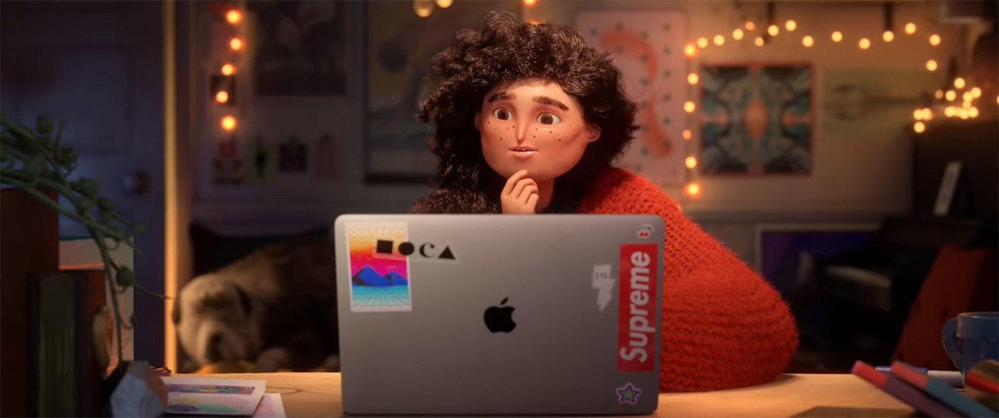
This beautifully put together animated movie celebrates the power of creativity and encourages creators of all ages to share their talents with the world. This tells the story of a young woman, someone highly relatable, who hides her creativity. She is clearly passionate about what she does (we see only a very fleeting glimpse of what that talent is), but she’s worried about showing it to even those closest to her -her friends and co-workers. Until it literally bursts out in public view like a happy genie out of a lamp. Teen singer-songwriter Billie Eilish’s original song plays along like a narrator.

No doubt, it’s a touching story. But more than that it’s great marketing. The movie is an ode to self-belief. That feeds wonderfully into Apple’s core values of self-direction, including creativity, freedom, curiosity, et al. The product placement is so subtle and understated, but it’s clearly an important support for the protagonist’s creative work. There is also a vital element of furthering the brand’s (lifelong) agenda of challenging the status quo. The story is meant to inspire people to shed their inhibitions, believe in their hidden talents, and share them with the world.

That combination of style, story, and substance is just the right recipe for my own Happy Holidays!


(This Perspective was originally published on November 29, 2018 by Shekhar Badve on LinkedIn)


8 of the Best Retail Spaces Globally
  • November 26 2018|
  • 0 comments |
  • Category : Blog

In the day and age of online shopping, it has become harder than ever to entice customers into a retail store. How do you persuade shoppers to visit your store amidst the traffic and crowds when they can buy what they want from the comfort of their homes? As the convenience of e-commerce becomes more and more evident, a retail store has to be much more than a place to showcase products. If you want customers to get out of their homes and take the effort to visit your store, you need to offer an exclusive store layout, stunning interiors, awe-inspiring experiences, and exemplary customer service. We’ve turned our attention to 8 of the best retail spaces ever designed – from car manufacturers to fragrances, toy stores to home accessories, footwear to apparel – these retail spaces are bringing the brick-and-mortar era back, and how! Join us, as we take you on a ride!

Adidas, Berlin:

adidas-nbhd-concept-store-berlin-02

In a market where competition is so intense, you have to think out-of-the-box to truly strike a chord with your customers. That’s exactly what sporting goods manufacturer Adidas began, with its neighborhood or NBHD concept stores. With the aim of plugging into the pulse of local trendsetters, artists, and streetwear fans, Adidas’ Berlin store is the perfect amalgamation of brand consistency and localized store design. The NBHD retail concept stores, now also operational in Shanghai, Seoul, and London translate the spirit of each city into a regional store adaptation that connects with the local youth culture. The end result? An exclusive store in each city, that offers products based on deep-rooted knowledge of local artists and influencers and gives each store a unique buzz and differentiation. The Berlin store offers a vibe that’s very local, keeping up with the city spirit through resident manifestos, graphic designs, and physical installations.

7-things-for-fashion-brands-to-consider-adidas-original-shanghai-flagship-store

Bulgari, Rome:

cms_slider_image4_6022

Italian luxury brand Bulgari’s Rome store exudes luxury in every manner possible. Redesigned and refurbished for the brand’s 130th anniversary in 2014, the space is inspired by its Ancient Greek and Roman roots. Positioned perfectly at the base of the popular Spanish Steps, the interplay between contemporary and traditional lies at the core of the store’s eclectic and captivating décor. The store showcases a wide variety of the brand’s jewelry, fragrances, watches, accessories, and all things luxury. The sparkling finishes of some of the world’s finest jewelry is infused in an indulgent retail space with one foot in the past, one in the present.

bulgari

H&M, Melbourne:

130927_H&M coming to Melbourne's GPO

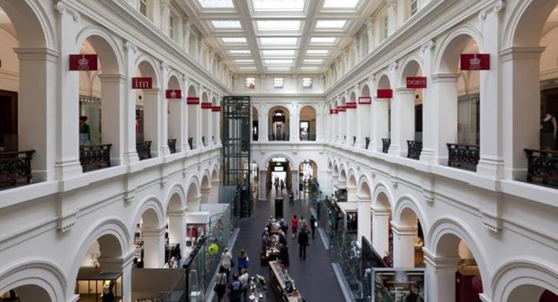
Swedish apparel brand H&M’s Melbourne store offers all of H&M’s clothing, kids, home and beauty range under one roof for a complete brand experience. What makes the store truly unique is its Victorian-era interiors with white walls and mirrors as far as the eye can see – a perfect blend of fashion and extravagant architecture that is every shopper’s delight. The former General Post Office, now a stunning 1600-square foot H&M store is spread over three spacious floors. The striking Victorian architecture offers a magnificent setting, with its columns, clock tower, and magnificence of the postal hall. Get mesmerized by the sheer grandeur of the building and enjoy its alluring features such as the checked stone flooring, arched doorways and elaborately ornamented staircases as you shop.

HM-500x460

LEGO, London:

lego-mosaic-maker-2-lego-store-london-embargo-17-11-16-copyright-lego

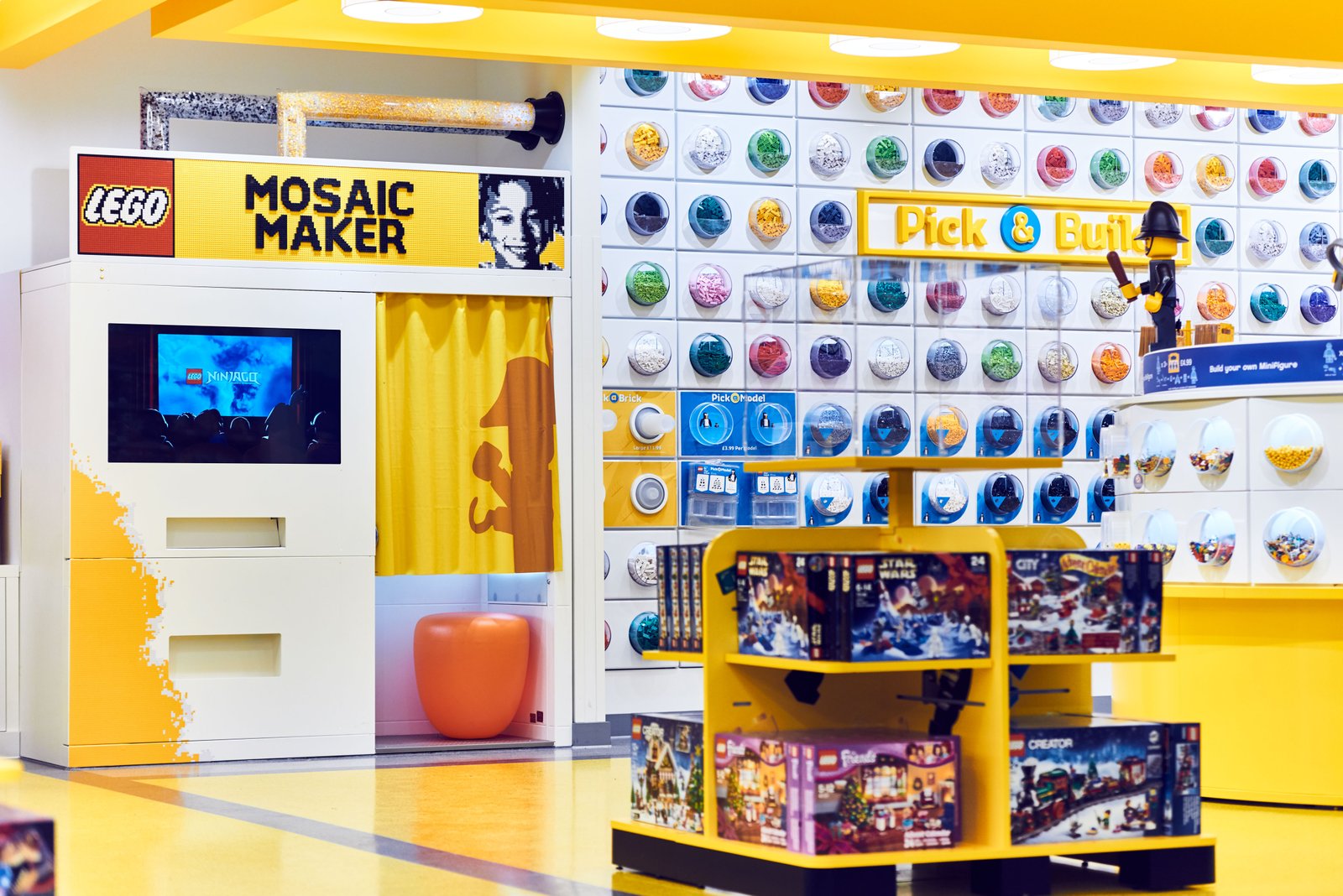
Danish toy manufacturer LEGO’s London store at Leicester Square is the brand’s largest store in the world. Opened in November 2016 and spanning 9,800 square-foot, LEGO London offers amazing experiences: get welcomed by the Leicester Square mascot, participate in the store’s monthly mini-build and get the opportunity to build your very own, one-of-a-kind LEGO mosaic portrait using the LEGO Mosaic Maker – just step into the photo-booth, have a picture snapped and get printed instructions and bricks to build your own LEGO portrait. You can also enjoy several photo-ops with life-size LEGO installations including the London Tube made from 637,903 blocks, the 20-foot tall Big Ben, Sherlock Holmes, a Royal Guard, a mosaic map of London, and more.

Ground-Floor-Interior-2-LEGO-Store-London-EMBARGO-17.11.16-Copyright-LEGO-760x507

Prada, Tokyo:

Img_1089_Tokyo_Prada_Omo_Eingang500

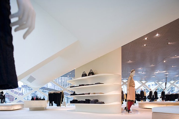
Italian luxury fashion brand Prada’s Tokyo store is one of Japan’s largest flagship stores that’s causing ripples in the retail space. The stand-alone glass building with its diagonal grid design is a distinctive work of architecture – sure to catch the eye at first glance. With six floors of products ranging from menswear to womenswear, fragrances to fashion accessories, the store offers brand enthusiasts and new visitors all that they desire. The store also houses several lounges and event spaces – and aims to blend the concept of shopping and pleasure with consumption and culture. The façade appears as an interactive optical crystal as you walk past it, and the glass walls with its structural cores and horizontal tubes not only support the ceiling but also morph into elevators and stairs, fitting rooms and display shelves – giving it a sense of unending shopping space that’s deeply integrated into the architecture.

Prada-store-by-Herzog-and-De-MeuronTokyo-03

Sabyasachi, Delhi:

sabya1

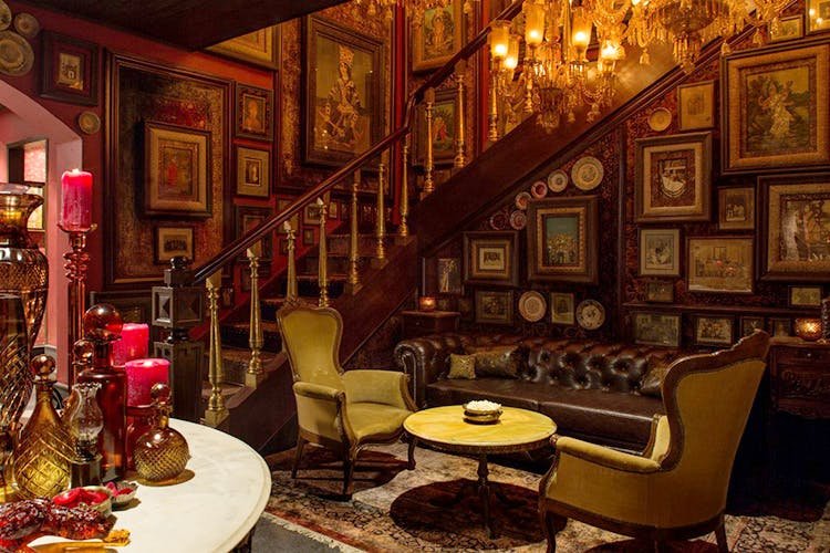
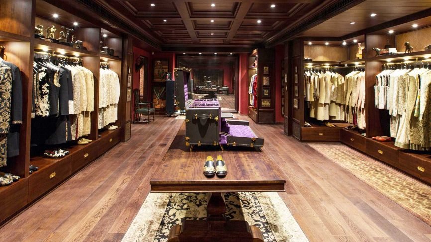
With designer boutiques sprawling across the Indian subcontinent, Sabyasachi’s flagship store in Delhi gives grandeur and opulence a whole new meaning: from hand-painted chandeliers to antique carpets, Tanjore paintings to studio portraits – the space offers a unique heritage experience to shoppers. Spread over 13,500 square-feet and two wings – one showcasing women’s bridal wear and jewelry and the other men’s wear and ready-to-wear sarees and kurtas –the retail space houses a large heritage monument and a grand colonial era-inspired staircase that is sure to transport you back to a historic era.

GQ-India-Sabyasachi-store-1-866x487

Swarovski, Innsbruck:

sva1

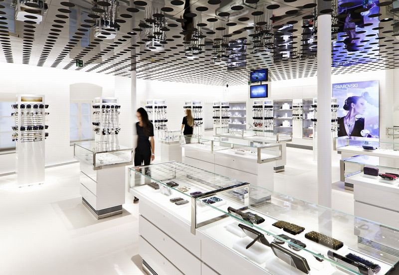
The home of Swarovski, the crystal store in Innsbruck is a glittering jewel nestled in the Austrian Alps. With a unique design concept and the widest range of dazzling sensations spread across two floors, the Innsbruck store is Swarovski’s largest and is sure to invigorate anyone and everyone with its sparkle. From spaces replete with enchanting crystal figurines by world-renowned artists to an exceptional range of contemporary and classic jewelry, the store brings together numerous Swarovski product lines under a single roof. The five-meter high chandelier is undeniably the masterpiece of the showroom and the art space on the first floor offers stunning satellite views of illuminated buildings of cities such as Athens, Rio de Janeiro, Johannesburg, New York or Dubai – an expressive symbol of Swarovski’s global network. As for post-retail therapy, The Bar offers a delectable range of refreshments.

4ee8f43804bc2edcbf81b76f06787735

Tesla, Manhattan:

A Tesla Inc. Model X P100D sports utility vehicle (SUV), left, sits on display at the company's new showroom in New York, U.S., on Thursday, Dec. 14, 2017. The Meatpacking District location, which opens to the public at 11 a.m. Friday, lets customers for the first time explore energy offerings, configure cars and place orders all under one roof. Photographer: Mark Kauzlarich/Bloomberg via Getty Images

Although Tesla spaces worldwide feature the latest concept models of the electric car, with more than 3 million people visiting every year, what makes the 10,900-square foot Manhattan space truly unique is the immersive educational experience it offers to visitors around Tesla vehicles and energy products in general. The store has been thoughtfully designed to appear contrastingly different to your traditional car dealer and greatly emphasizes the uniqueness of the brand: an entire wall is dedicated to showcasing Tesla’s competence in sustainable energy; the design studio allows you to design your own Tesla using a configurator. And if you want to learn more about electric cars, just head to the seating area and get all the information you need from the highly enthusiastic staff on electric vehicle tech in general, not just Tesla.

5a32edbfb0bcd533198b4f1e-750-563

A common thread running through these amazing stores is that the design, interiors, layout, and the concept of the stores stand out not for their empty opulence but for the fact that the stores represent the very essence of that retail brand. The best-designed stores reflect the brand in subtle but meaningful ways. Bulgari is about heritage, Prada about opulence, Lego about building things, Tesla about responsible innovation -it’s all apparent. A visitor to the store instinctively knows what the brand stands for -and buys into it even while being captivated with the décor and the layout. And, that’s the key. So, which of these iconic stores are you planning on visiting first?


Looking for help in designing your retail store? Reach out to us on info@lokusdesign.com


6 recent packaging designs in the personal care space that caught our eye
  • November 22 2018|
  • 0 comments |
  • Category : Blog

Nations such as India and Brazil are seeing tremendous economic growth. With that growth comes a significant rise in the disposable income of the people. These more well-off consumers are changing their buying preferences, consumption habits, and requirements too. One of the changes this affluence has sparked is an interest in higher value and better designed personal care products. As it happens, the APAC geography is doing particularly well in the global personal care products segment. Marketers anticipate a sustained growth rate of over 5% and India is among the major contributors.

As consumers become more sophisticated and demanding, the personal care packaging is also witnessing major transformations. The lifestyle influences and aspirations of consumers have inspired brands to carve out enthralling, sophisticated, and, yet, functional designs.

And… this is where companies are finding the need to implement innovative new packaging trends. Here are 6 personal care packaging designs that caught our eye:

Art Stick Liquid Dip – Multinational marketer and producer of personal care products, the Estee Lauder Companies Inc. have taken a step forward in designing innovative and premium packaging products. The company, in an endeavor to impart the sense of a playful experience while applying Lipstick, packaged a convenient BobbiBrown Art Stick Liquid Lip in a disposable container.

bb_prod_EG7L_415x415_2

Especially targeted at the Millennial audience, the concept of colour cosmetics in the form of Art Stick brought to mind a childhood staple -the crayons from art class.

Bubble-Shaped HDPE Bottles from Soaper Duper

Several global brands are stepping up to save the planet from the devastating effects of over-exploitation of its natural resources. Soaper Duper is one such brand. This brand is a leading maker of naturally-derived body and bath products. The company has designed a bubble bottle with one hundred percent Post-Consumer Recycled Plastic. The bottle is playfully shaped like a set of soapy bubbles, as a reminder of the utility. These green-hued HDPE bottles are making a notable difference to our environment.

Soaper-Duper-BodyWashTrio-Small_0

Head & Shoulders’s shampoo bottle with 25% recyclable beach plastic

Spreading awareness of plastic contamination in our oceans and beaches, Head & Shoulders’ introduction of recyclable beach plastic bottles design was awarded the United Nations Momentum for Change Award. The P&G brand had partnered with SUEZ and TerraCycle to launch their shampoo bottle produced out of 25% recycled plastic. The material used was recovered beach plastic and the bottle itself was designed to be recycled. The users have the satisfaction of caring for the environment, even as they gave their hair the very best in care.

article-image-EN

Stackable, clickable makeup concept by Trinny London

Trinny London, a personal care company based in London has launched a brand-new line of products with a customized packing concept. The packaging allows women to stack and arrange their personal care products based on their needs. They could create stacks for specific purposes such as eyes, cheek, and face. This customizable kit comprises 5ml pots, an epitome of state-of-the-art technology. The containers are superb for portability, comfort, and fulfilling the individual requirements of each user.

The base of all the transparent jars (or pots) is equipped with click-fit functionality that latches with another jar upon stacking. The transparency and the labeling of the pots in hues like statement lip, smoky eye, starter pack, and fresh face look pots, allows the makeup wearer to decide the combination of hues and functions that make the most sense to them.

Screen Shot 2018-11-22 at 4.48.53 PM

LBK Nails’ introduce Gel polish with multifunctional cap bottle

Consumers have often complained of notable differences in the actual and the displayed colour of a nail polish. Kemeny’s LBK brand eliminates this problem with a packaging design innovation. This Gel Polish is UV-protected with multifunctional cap and an opaque bottle. The bottle is equipped with a hinge containing a fingernail-shaped pop-up piece painted with the polish that is sold inside the bottle. The advantage of the design is that it allows the customer to overlay the pop-up piece over their fingernail rather than opening the bottle and trying the gel polish. Style and extreme utility are both at the fingertips of the consumers!


LBKnails_slider3

With personal care products, it is individuality and style that must be in focus. In that scenario, packaging that catches the eye, while revealing the inner core of the product is essential to connect with the consumers and rack up the sales. When it comes to personal care products, consumers today prefer a packaging design that is responsible, sleek, science-backed, and beautiful. And these brands here have made an awesome statement!


Reach out to us on info@lokusdesign.com


F & B packaging trends to watch out for in 2019
  • November 22 2018|
  • 0 comments |
  • Category : Blog

By 2020, the food packaging industry in India will soar to $65 Billion from the current $40 Billion. Being one of the five biggest packaged food sellers globally, India has established its position as a key market globally. The volume makes it Asia’s second largest country with over 34 Million tonnes of sales volume. Despite these promising developments and predictions, it is fair to say that India is still an evolving market for packaged food. This evolution is driving changes in the food packaging too.

Some prominent reasons for developments in F&B packaging include:

  1. Urban lifestyle changes
  2. Rising incomes of consumers
  3. Changing need for preserving food quality
  4. Encouraging reduced amounts of food preservatives
  5. Drive to reduce food wastage
  6. Protection against external and chemical damages
  7. Informing customers and marketers about the food quality and its ingredients

2019 F & B packaging trends

Consumers are becoming increasingly aware. F & B brands are encouraging production in close alignment with high-quality, clean, fresh, organic foods, and sustainable or eco-friendly packaging. Undoubtedly, quality certification still remains the top priority. This trend is gaining momentum among marketers and consumers at large. Crowded grocery shelves demand product characteristics and offerings that can make the brand stand out.

Here are some of the top trends in F & B packaging that could transform the food and beverages industry in 2019.

Artistic impression – Artistic impression in F&B packaging often proves to be incredibly effective. Quite the emotional way to connect with consumers, it has been in the trend for almost a year now. Although the design implementation has been sporadic, artistic impression could well work wonders in 2019. More and more brands are incorporating this design trend. Packages will carry intriguing graphics conveying a message from the brand to its customers.

absolut_chicago__0000

Absolut Chicago has been a trendsetter in this category. Teaming with Chicago’s acclaimed design community, Threadless, to carve an appealing city series edition that portrays the style, heritage, and unique flavor of the city.

Packaged to carry – Consumers on-the-go often resort to making online purchase. Brands face cut-throat competition and must go above and beyond to get loved and consumed by people. In this scenario, packaging could literally help the brand stand out.

awards

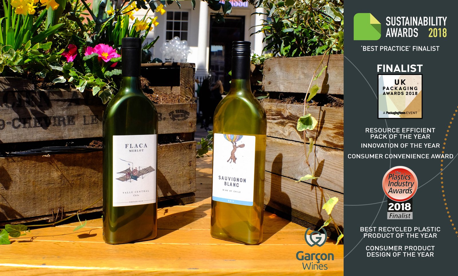
Garcon Wines, the first and the leading manufacturer of flat, full-size, innovative wine bottles is a leader of this very trend. The brand presents a 100% eco-friendly, sustainable, convenient, and economical solution by using the post-consumer recycled PET in their bottle packaging.

Reinvigorating the staid look – This worked great for the Rice Ramen Noodle line. The company was actively trying to re-introduce their instant noodle cup into the comparatively healthier, flavorful, and sustainable rice noodle category. Rice Ramen was launched in the Red Miso, Masala Curry, and Tom Yum flavors. With Bulldog Drummond’s concoction of clever language, bold typographic look, playful patterns, and bright hues, the packaging clearly helped the brand showcase their different outlook.

Hues for you – Global brands are making a bold move by introducing bright, contrasting colors on packaging to shine on the shelf and bolster brand recall. Brands are also offering their customers a rare experience by personalizing their products. It’s not only the world’s biggest brands like Coca-Cola or Nutella are up for this. 2019 will witness the rise of smaller brands personalizing their design to attract customers.

maxresdefault

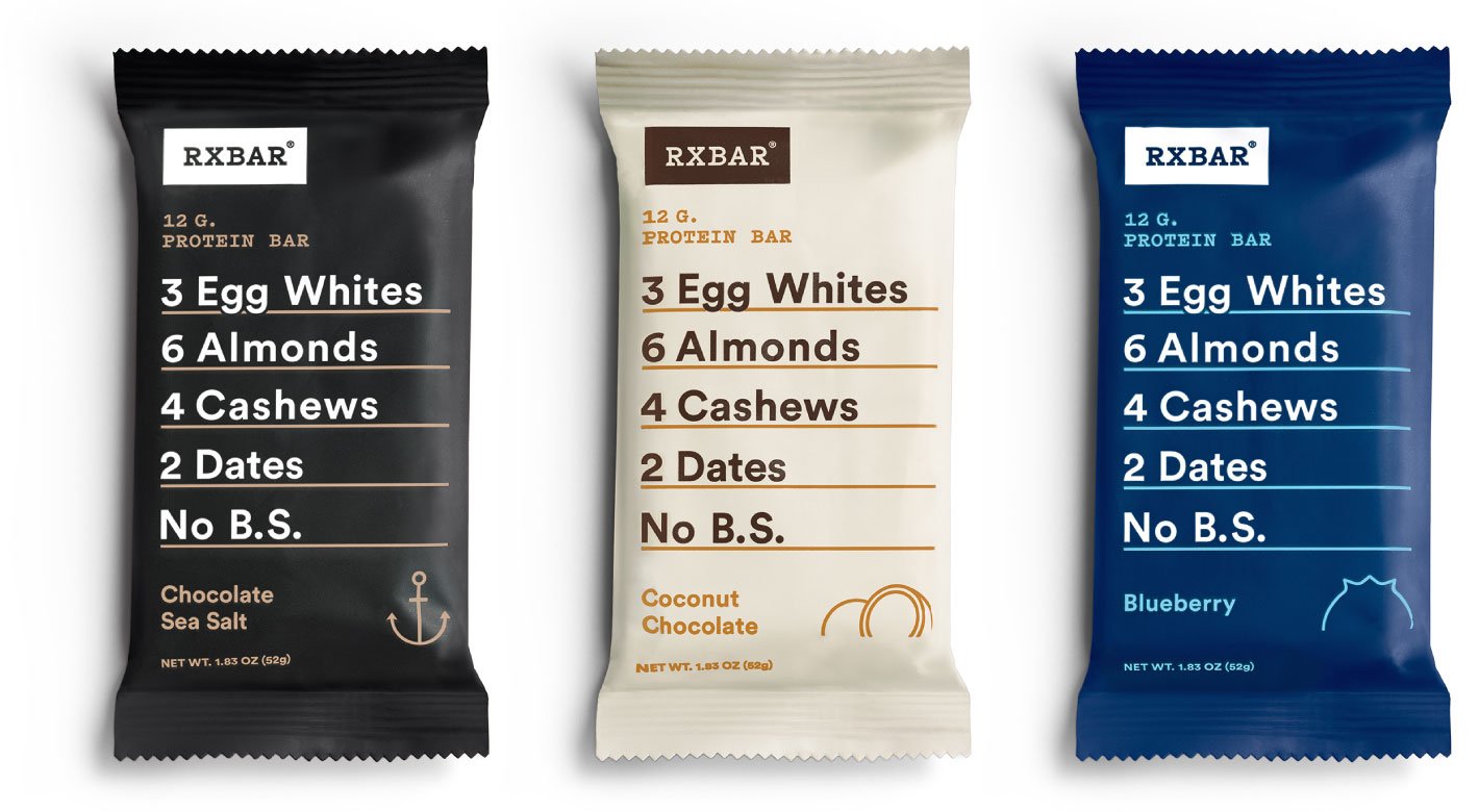
Telling customers what’s important – Browsing the shelves for protein bars? There are dozens of them right there and you will have absolutely no idea what they can do to your health. And RxBar was one of them until its packaging was redesigned to give all the vital information the health-conscious consumer could ever need -in big, bold fonts displayed all over the package. In a world where consumers are much more conscious about what goes into their bodies expect this transparency to become the norm in packaging.

threebarsv2

RxBar lists out its ingredients and calorie count in one unit on its packaging. A clever idea to save time and efforts of customers in knowing everything they need to know while buying a protein bar!

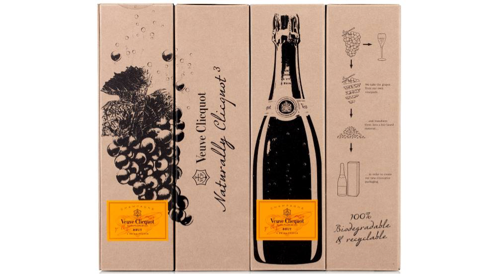
Eco-friendly, the need of today and tomorrow – A commendable move from Veuve Clicquot! The brand packaging clearly showcased its concern and commitment towards the environment by showcasing products sold in 100% recyclable packaging. The most intriguing part is the material used to develop its packaging – Transformed Grape Skin! Veuve Clicquot has managed to stand up to its commitment of being an eco-friendly brand by reducing waste and carbon-emission percentage. And, it’s done that while staying true to its roots (or should that be its vines?).

Untitled

Eco-friendly packaging or ingredient-based packaging have already been introduced. We expect that trend to rise, indeed to dominate in 2019. The trends, in this fast-evolving space are changing at a breakneck speed. This is all driven by changing customer values and technological development. Brands will need a visual style that can help them boldly make their presence felt -and it could be by adopting one of these packaging trends that they may achieve that!


Reach out to us on info@lokusdesign.com.


7 mistakes to avoid when branding consumer durables
  • November 01 2018|
  • 0 comments |
  • Category : Blog

Screen Shot 2018-11-01 at 3.13.19 PM

From your coffee maker to your electric toaster – your hairdryer, your smartphone, washing machine your electric toothbrush – it’s all in the consumer durable category. But what makes a brand more successful than the others? It may be down to how the brand is perceived by its consumers.

Consumers may not know the specific tangible differences between two brands – however, they still have preferences and these preferences are only created because of a brand’s image and its positioning in the markets.

Isn’t your company name and logo enough as branding?

The answer is No. Your company (product) logo and name are part of your company’s identity. They do not convey everything that your brand stands for – the quality, the values and most importantly – the core values and Purpose of your brand. A comprehensive branding and positioning exercise is extremely important for your brand – for this is going to be your product truth for years to come. To put it simply – the perception of your brand, your reason for existence, your logo and the advertising – all of these must come together in your brand identity.

Branding your product properly improves recognition, it helps your consumer build trust in your brand, it helps you build relationships with your consumers better. It adds financial value and generates new customers too. But, even when branding is so crucial for consumer durables, companies make these 7 common mistakes while branding their products:

  1. Not aligning with your purpose and core values

For a brand, the most important part of their positioning exercise is to understand what their purpose and their core values are. A brand and the core team driving it– need to define what their brand stands for. Then all the actions the brand takes must be aligned with that Purpose. Any divergence creates dissonance, lack of trust, and, eventually, chaos.

  1. Underestimating or underplaying your brand

Another common mistake most brands make is underestimating their brand story– it is important for you to not just believe in your brand, but also to believe in its true potential. A brand is only what you make of it. You cannot expect your consumers to buy into a story even you are not completely convinced of.

  1. Keep it simple, silly!

The KISS philosophy is universal– and even more so for consumer-focused brands like durables. If your communications are unclear you are only going to confuse your audience. A classic example of this is Onida – one of the most popular brands in the 80s and the 90s – Onida was rightly called “neighbour’s envy, owner’s pride”. The devil with his two red horns became the identity for Onida and in fact, took the brand to new heights. It was easily one of the best marketing strategies of all time for Indian consumer durable products. The connect it established with the audience was so strong that Onida was initially able to withstand the big-bang entry of the Korean TV brands, LG and Samsung. Over time the brand’s influence has waned as a new generation unfamiliar with the devil came in. Life has come full circle as in 2018, the devil has made a comeback and has become the focus of Onida’s efforts to capture more market share.

  1. Using cliché design elements that make you merge into the background with other brands

It is extremely important to have well-considered and relevant design elements feeding into your Brand identity. Using elements just because they are trendy or popular, essentially succumbing to the entropy of the marketplace can hurt the brand. Microsoft, for example, while introducing Edge, created a logo uncomfortably like the Internet Explorer logo. Everyone from the early days of the internet have their own stories of that departed browser. And the Twitterverse along with the critics delivered their judgement, a big no! Why make a new browser and give it almost the same identity – colors and logo?

  1. Inconsistency across channels

It is important for every brand to have a strong and consistent message on every channel – from your ATL advertising, your social media to your outdoor and your BTL activities – if your brand truth is not changing – why should your messaging? Of course, you may extend your messaging and talk in context when it comes to social media and BTL but overall –consistency is critical. For example, when Apple launched iPhone 6 with a brilliant campaign – focusing only on the phone camera, the campaign was a simple, one-line statement – “Shot on an iPhone”. And from their social media to their ATL to their BTL, you only saw them talking about the wonderful camera features. They even crowd-sourced their social media content by asking people to click pictures on their iPhone and share them. That’s a great example of the consistency a brand needs.

  1. Managing your social media responsibly

Even the biggest brands have made the mistake of not managing their social media responsibly – Right after the launch of iPhone 6 Plus, many users were worried about their iPhones bending in their pockets and breaking. This is when someone from LG’s (France) social media team decided to be creative and tweeted an image of some bent phones and copy that read “Your LG phone won’t bend”. As it happens, this tweet was sent from an iPhone and, sure enough, the world noticed. Needless to say, the tweet was soon deleted but it sure went down in the history of biggest social media fails by brands. For every brand, small or big, managing their social media responsibly is crucial.

  1. Poor Customer Service

Customers are your priority – that’s where your focus should. In a world where every customer is capable of becoming a broadcaster, and every poor experience has the potential to “go viral”, customer service is also a part of the overall brand experience. This is especially true in the durable space where the products costs more and is expected to last longer. Customers with problems should be handled with caution. Focus on creating intuitive and effective customer care processes and on training your customer care executives. Pay attention to the online universe for negative comments and complaints -and be ready to provide a customer care experience that fits into the overall brand story seamlessly.

Don’t let your consumer-durable product become a victim of poorly-considered branding. Take expert help, know your brand’s essential truths and stick to them. Remember – products are made in factories but brands are created in the mind!


Looking for help in branding of consumer durables? Write to us on info@lokusdesign.com.


E-commerce Branding Best Practices
  • October 31 2018|
  • 0 comments |
  • Category : Blog

In the e-commerce world, sales are entirely web-based or app-based. Your website/app is your hub and sales are driven by online advertising and branding. It’s “No branding, no sales” in the competitive e-commerce space -there’s always another site available for the consumer! How do you create and promote an online brand and how is it different from the traditional?

While the principles of branding are universal, the online world is multi-channel and provides data on customers in a way unheard of in traditional businesses. Connections are rife, with lots of interplay with social media.

Online Branding- Old and New Challenges

The internet provides customers with more information, wide choice, options, and comparisons. Savvy customers hold the power, not the seller. How do you master this new domain and build a bond with customers online? Can old branding strategies adapt to the online world?

The online experience is about getting into the eye line of prospects and then capturing their attention. Much branding and communications is focused around driving “uniques” or “first time” visitors -essentially folks trying the site out. The key requirement from an e-commerce brand creation effort is to build Trust that will make customers actually transact and pay online and then visit again and again. Trust can be gained by creating an unmatched customer experience and making it consistent over time.

Here are some of the E-commerce branding best practices that can help you build a strong brand:

Basics:

Make sure the product name is unique and impactful. Good tag lines are critical.

See the OYO rooms tagline” Aur Kya Chaiye”. Oyo Rooms disrupted the hotel business in India by providing serviceable rooms, standard features, and brand name recognition at affordable costs. The #AurkyaChahiye campaign of OYO, highlighted that good rooms were available for as low as Rs 999 -what else does a traveler want? The self-booking domestic traveler lapped it up and, as it happens, so did the previously unbranded local hotels and inns that suddenly became part of a mega brand.

oyo-1-638

Choice of Voice and tone of messaging is very crucial in building a relationship with the buyers. The more human the voice and tone, the better.

Hotstar created a digital entertainment revolution in India. The HotStar app had 2 Million downloads in the first 10 days itself. Today it is the largest provider of entertainment content in India.

43561eb7-7006-43d1-948a-e5e6034ce31e-original

Hotstar used tone effectively in its ads. For launching the Game of Thrones content, they had a witty, sarcastic tone that took on the sneaky torrents way of viewing content. They launched with the slogan Torrents Morghulis’ (torrents must die), a smart reference that spoke directly to GoT-fanatics.

Designing Your Digital Display Shelf:

Your website/app must use the appropriate visual elements: design, colour palette consistent with the brand, relevant imagery, and typography that contributes to the branding. Note that far more purchases happen via mobile apps than via websites. The approach, thus, must be “mobile first”.

The quality of the company’s website and app is directly related to the level of trust the buyers will have in the brand.

The more information the site gives about the product the better. The more intuitively it is presented to the buyer the better it is. The easier it is for the buyer to transact, the more likely the transaction will take place.

The buyers must be able to get an almost “touch and feel” like experience on the website. This must be consistent with any offline channels the brand may be exploring. Brand communications and the site itself must reflect the multi-channel nature of the brand and include information from offline campaigns to present a cohesive picture.

new-ditto1

User Experience:

Most people will reach your site and product page via a Google search. This suggests branding considerations unique to the online world. The first being to choose a good domain name and clear URL, easily typed out (and now apt for voice search!), and intuitive.

The online buyer worships convenience. This means the brand must ensure smooth transactions, interactive and engaging elements, and provide comprehensive and intuitive search options.

“Branded Content” has a key role to play. Good content creates customer engagement. It creates a story around the brand and its offerings. It presents a compelling reason for the user to buy. Content also drives the search results that bring people to your site/app.

Social and sharing:

Social Media is a force-multiplier for the online retail brand. This is a channel to reach out and connect with the target audience, engage the former customers, and solidify a relationship with the loyal customer. This means the communication on the social channels must also be consistent with the brand messaging and communications across the other online and offline properties.

Social media posts must be engaging and impactful, with high-quality images and succinct messaging. This content has the potential to “go viral” -so creating content that is inherently shareable because it fits with the values the buyers share with the brand is key.

Untitled

The beverages brand Paper Boat was known for home-made juices. The product had an association with childhood memories. Paper Boat used an innovative way to drive content and engagement in one sweet mix. They asked their audience to share their childhood stories on social media. The Facebook page of Paper Boat is a delight and replete with users’ comments.

The Big Question:

In a branding world made more complex by the emergence of the online store, a natural question for Brand Managers is how to maintain consistency across all these channels? Especially in an environment when any social missteps can explode into the public consciousness? The answer is to ensure that all branding, communications, and indeed, all other activities be driven by the core values, the Purpose, that is at the heart of the brand. If this is the touchstone by which the aptness of all decisions is measured, then not only is consistency sure to follow but the relationships formed with the target audience will also be more authentic and longer-lasting.


Looking for help to design your E-commerce brand? Write to us on info@lokusdesign.com


4 logo design stories each brand can learn from…
  • October 27 2018|
  • 0 comments |
  • Category : Blog

Screen Shot 2018-04-10 at 8.18.32 PM

The logo is often the first point of contact of a brand with its customer audience. It is a vital marketing tool for the marketers to create, establish, and cement the brand’s identity in the minds of the consumers. The logo reinforces what the company or brand is trying to communicate about itself by providing a unique visual stamp of the identity of the brand.

A good and effective logo design is meant to attract people’s attention. It should reflect the essence of the brand -the core values, the Purpose, the heart of what the brand represents. The logo should have an immediate impact on the viewer. A great logo helps in brand penetration and recall. It helps remind the customer while making a purchase as well as making recommendations.

This is why brands put in a lot of consideration and thought into designing a logo. It is imperative to devote attention to every minute detail of the logo – from colour to design to graphics and font.

Designing an effective and impactful logo is, of course, hard. Logos, like all symbolic imagery, are open to subjective interpretation. This suggests that there may be things that might not be visible to the team designing the logo but may be what jump out at others. For example, the Airbnb logo was widely criticized for being sexually suggestive and obscene which the designing team almost certainly didn’t intend.

When it comes to branding failures, the biggest brands across the globe have faltered at some point in time. Names like Google, Pepsi, Tropicana etc. have made their own sheepish entries to the list of biggest brand failures.

Here are 4 logo design stories each brand can learn from…

Cafe Coffee Day

Untitled1

The most loved Indian coffee chain across the country is driven by its captivating tagline – A lot can happen over a cup of coffee. Such an apt tagline for a cafe where people could unwind with friends, job seekers could interview in a safe zone, prospective dulha meet potential dulhan in neutral territory, and professionals meet to discuss and seal some deal! But the brand really saw success after they rebranded and repositioned the brand in the market.

“It all started with the brand seeking to sharply refine its positioning — research helped us realise that the café outlets have become more than just a coffee shop; a social hub where people meet for a steaming mug of cappuccino, for a chat, for business or even without business — just a catch up with friends,” K Ramakrishnan, President Marketing, Cafe Coffee Day.

The brand recaptured their target audience by redefining their logo to depict what the essence of the brand meant. The closed square transformed into a dialogue box which signified the brand’s positioning in the market. People could connect with the brand’s reason for being and that’s what a logo is meant to do.

Royal Mail

Untitled2

In January of 2001, UK’s largest mail carrier made an announcement of a new brand and company name – Consignia. The step was criticized by people across the UK with Mike Verdin of BBC News commenting, “A duffer. A howling waste of money.” The sudden change in the name and logo of the brand took people by surprise. This became almost an existential crisis. The Royal stamp was at the very heart of the brand -you could trust them with your mail, after all, so did The Queen! The original name had history, heritage, and it’s function emblazoned all over it. The new brand failed to connect with the people. The logo was mundane and the name, though it suited perfectly for the services provided by the company, too tricky for the masses. After the public outrage and denial of acceptance to the new name, a year later it was renamed to Royal Mail.

GAP

Untitled3

This is among the most talked about brands when we talk about rebranding fiascos. The initial GAP logo had created an identity in the market over the 20 years of the brand’s existence. The logo had recognition, as any 20-year old brand should, but it also conveyed a sense of simplicity and style. The name spelled out in all caps inside a blue box was seen as classic and very American. In late 2010, in a classic case of succumbing to the entropy and brand chaos surrounding retail and consumer brands, the company decided that they needed to be seen as “young”, ”cool”, and “happening”. A new logo was dreamt up to showcase this new “Gap”. It ditched the All Caps, broke out of the blue box, and elevated the box to almost an afterthought floating away like an errant thought bubble. The audience hated everything about it -the general sense being that the logo did not represent any of the values that Gap had traditionally stood for. The logo had to be dumped within a week of launch -and no one lamented its passing.

Master Card

Untitled4

The logo of a company holds meaning and speaks directly to its customers. The MasterCard rebranding with a new logo was disastrous. The new logo was seen as amateurish and conveyed no new meaning. A careful look revealed that the gradient centre circle wasn’t even centred right. The new logo came across as a lazy attempt at redrawing the initial logo. It was seen as sloppy, lacking attention to detail, ill-considered, and, fundamentally non-serious -not traits you would want to associate with a financial product!

Paula Scher has said, “It’s through mistakes that you can actually grow. You have to get bad in order to get good.” That’s sound advice, and that’s the light in which to view the stories of these 4 brands. This is where these brands started their journey to growth -and left examples for the rest of us to follow.


Looking to design a strong logo for your brand? Write to us on info@lokusdesign.com.


The Importance of the Art of Looking, Drawing, and Storytelling
  • October 17 2018|
  • 0 comments |
  • Category : Perspectives

We live in a society, so we believe in what it tells us, preaches to us. We accept it all happily because we feel it is good for us. The society has made standard systems for every field and if any particular system says this is a problem, we take it seriously and work on it. A few years ago our education system became very conscious of Dyslexia and said if some of us have a problem with reading, writing or understanding it is a serious issue and we need to work on it. So we also become conscious and accepted that problem.

EXCUSE ME  ” I DON’T KNOW HOW TO DRAW AM I SUFFERING FROM DISPICTORIA?”

The current scenario:

We live in an era which is witnessing the fall of the human intellect- where people like to follow each other more than making their own decision. We always say that the human brain has so much potential and we are just using 10% of it. One of the reason is that our education system only focuses on the left hemisphere of the brain, by training analytical and rational thinking through reading, writing, and arithmetic. It ignores the right hemisphere which is responsible for visual thinking, imagination, and creativity by keeping drawing classes once a week and portraying them as a fun activity, stress buster or peripheral skill. We believe in it and just develop those abilities which enable us to become Doctors, Engineers, CAs, CSs, Bankers, and Govt. Employees but not creative professionals.

Why it is important to develop the right brain

Why does a child cry when it has to go to school? Why does study feel like pressure? Why does learning a new theory or formula feel so difficult, but watching a movie feels like fun? Nobody asks us to learn songs but still somehow, we just learn them, almost automatically. Why is perceiving information through movies or visual media easy? Why do illustrations make information easier to understand. Why is there so much positive and voluntary response for movies, songs, and other visual media and not for the studies the way education system trains us?

Some Biological and Psychological facts:

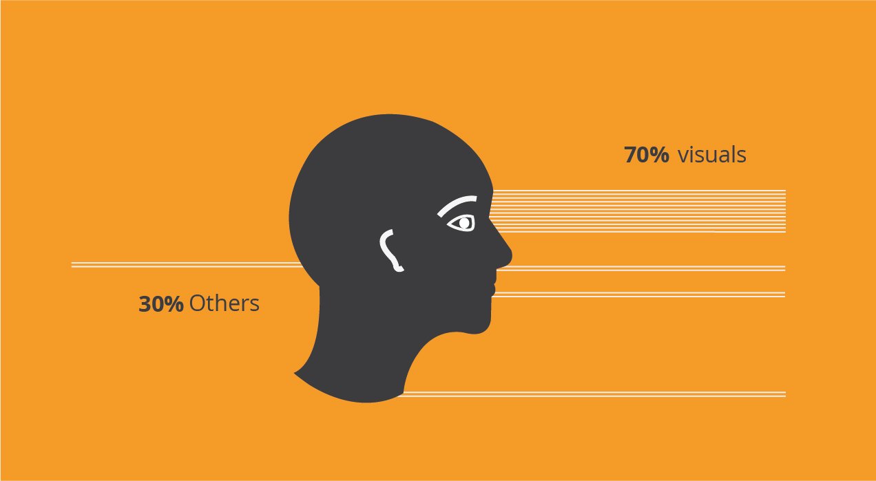
01- Perception of information from surroundings through our five senses is not equally distributed. 70% of the neurons are connected to the visual part and brain craves for visuals all the time in fact since our childhood. This is the reason why we understand visual communication better and faster.

BLOG illustration-01

02- Humans are designed to learn through their senses. But our education system makes us text literate and not sense literate. When we were born, drawing was as similar to talking, walking and other basic skills. Nobody had told us but still, when we were just a year old, we started scribbling. At the age of three, we drew our mom and dad, and in fact our cat as well. At the age of five, we made a marvellous landscape with a sense of perspective and proportion, and we didn’t even miss the doorknob on the door. But at the age of ten, this ability got suppressed because of the heavy training on the left hemisphere of the brain. And today we believe that we don’t know how to draw- that drawing is God’s gift that we don’t have.

BLOG illustration-02

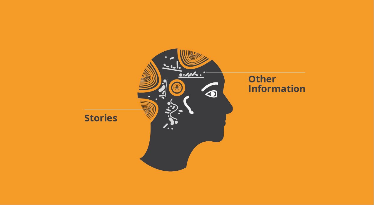
03- We don’t use much of conscious thinking while watching cinema. It feels involuntary, where you understand everything. It is not as difficult as understanding refraction of light or a law of physics. When we see or listen to a story, we understand it very easily because it is told in a sequence. When anything is told in a sequence, it gets categorized in our brain very easily. When something gets well-categorized, it helps us differentiate it from other pieces of information inside the brain. It creates a strong recall  of that information. When you understand well, you communicate well.

BLOG illustration-03

Why stories are so satisfying?

When we experience stories, it gives us a feeling of completion. The format of storytelling has a circular nature. It has a start, a mid and an end- a complete format, which is very easy, soothing and satisfying for our brain. Facts and other pieces of information are like a straight line. But the feeling you get when information is in a circular format is way more humane than any other format.

BLOG illustration-04

Subconsciously on a deeper level, we don’t even realize but we relate it to the basic concept of life story- which is birth, dharma, and death and to the all natural processes like- the water cycle, the nitrogen cycle or the food chain. They all have a circular nature. This is the reason you feel so complete and good after experiencing storytelling. When we add a hero, conflicts, struggles, achievements, hope and a positive end it just works like muscles for the skeleton of the story. That is why we always tell stories to our children, friends, family and even in professional world for brands- storytelling is in our instinct.

Results of a well developed Right Brain

Firstly, nobody is asking you to become an artist, or a designer or a filmmaker- but please note that these abilities are as vital as reading, writing and arithmetic for all cognitive activities. Secondly, after the development of this suppressed sense, you won’t look at a thing, how others are see it. Perception is not based on a mathematical formula, it is very subjective, it entirely depends on your personal visual experience. When you develop a concept from this new percept, it becomes very original and new because it’s entirely yours- you own it and this gives a feeling of individualism and your existence. Thirdly, it’s a journey towards innovation and invention because here nothing is copied or repeated, it’s new and fresh- which is a sign of growth and an art of expression for an individual.

Just like there is a difference between a literate mind and an educated mind, there is a difference between and educated mind and well formed mind!


(This perspective was originally written by Shubham Saurabh Gupta. Shubham is Graphic Designer at Lokusdesign and he takes keen interest in visual thinking and sense making)


To Retail Brands With An Eye On Ikea
  • October 13 2018|
  • 0 comments |
  • Category : Perspectives

0

Ikea’s Hyderabad store opening was the stuff of retail legend. There were traffic jams on the highways leading to and away from the store. Footfalls and sales were at levels seldom encountered in India before. Even the in-house restaurant is said to have clocked enviably high sales on the opening day. Despite it being early days yet, there is a sense that this take-off is due to more than mere curiosity. So, what’s going right?

The principles that have driven Ikea to success worldwide are amply visible in Hyderabad too. The products are created to fit the everyday needs of everyday people. They are well-designed, priced relatively accessibly, and always innovative. This design-led innovation to address everyday issues is demonstrated in so many visible ways -for example in their fleet of solar-powered electric auto-rickshaws for home-delivery. This combination of the international Ikea values with an Indian-tadka seems to offer a template for a wider nationwide conquest. And, other furniture brands seem to be taking notice.

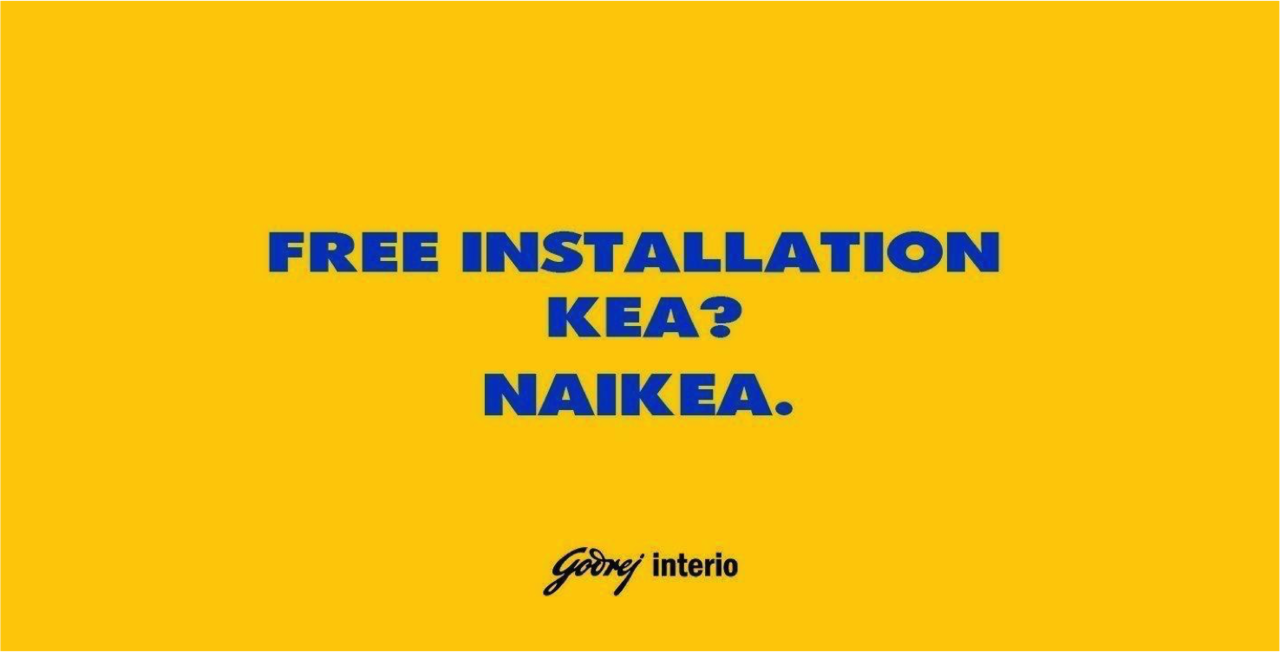
Godrej Interio came out with a serious of ads with jabs at what they perceived as gaps in the Ikea offering. Cleverly worded and decked out in Ikea’s traditional colours and fonts, they asked questions like “Warranty ke saath kea? Naikea.” Other ads pinpointed things like the lack of an EMI option, paid home delivery, and no free installation. But, is that a good thing?

I, for one, don’t think so! At the tactical level, Ikea has always been transparently clear that these benefits do not form part of their traditional offering -so it’s not like it’s a great surprise to the folks thinking of patronizing them. In fact, in many ways, it only reinforces what Ikea has always said about itself, “By removing these inessentials, we reduce the costs for you.” The bigger risk, the brand is trying to define itself on the terms of the competition -not on the basis of what matters most to itself. I have always said that when brands give in to such a hyper-competitive mindset, they lose time, money, and energy in trying to play catch up. This adds no value to their customers also. I would suggest that brands like Godrej focus on what makes them tick -their “Purpose” and their inherent positive valence. Focusing on that and communicating that through their every action is more likely to help them make a real connection. Kind of like what Ikea seems to be doing!


(This Perspective was originally published on October 9, 2018 by Shekhar Badve on LinkedIn)


Just ‘Cause – Why Brands Shouldn’t Support Causes (…And Why They Should)
  • October 13 2018|
  • 0 comments |
  • Category : Perspectives

0

I’ve written here that I think Nike may have been justified in their recent choice of ad spokesmodel (you know the one I’m talking about). I have also written here that I do not believe the assorted pubs, doughnut shops, and mattresses gleefully posting meme-worthy content on their social channels after the Sec 377 verdict were similarly justified. Hypocrisy much? Well, you decide.

To my mind, the most critical question of this discussion is not whether the cause itself deserves support or not. There’s no doubt the big things being spoken of here, race relations, nationalism, respect for law and order, equality in love, et al are worthy of support from every decent human being out there. This also does not mean that it’s only up to individuals, not brands, to take up such worthy causes. In fact, I would go as far as saying that brands should be deeply concerned about creating a positive impact in the lives of their customers, employees, and the society that they serve.

My key issue is more whether a brand should dive into a particular debate or not? I believe that there is only one question for the brand to answer and that is, “Does this cause resonate with our core values and purpose?” If the answer is “Yes”, then there is valid reason to add your muscle to the messages out there. If the answer is “No”, and you are tempted to surf a giant wave only because it’s there, then I would recommend restraint. In the first case, you will appear authentic and gain the trust of a genuine audience. In the second, you risk being seen as opportunistic and superficial – all for 15 minutes (if that!) of fame.


(This Perspective was originally published on September 18, 2018 by Shekhar Badve on LinkedIn)


« First‹ Prev45678910Next ›Last »
© 2018 Lokus Design Pvt. Ltd. All Rights Reserved.